The City Line Changes the Rules in New York
Inside New York City, social life and connected streets lead; outside it, nature and balance become easier to find.
Cross the Hudson from Greenwich Village to Montclair and the neighbourhood bargain changes.
In the Village, cafés, culture and connected streets help carry the highest overall score in the New York metro. In Montclair, the runner-up, the strength comes from greenery, buildings and an unusually even mix of qualities.
They are two excellent places built on very different foundations. That is the central lesson from HoodEx’s first New York report. The 44 scored areas stretch across three states, but they do not behave like one market. The New York City line changes what residents get and what buyers pay for.
The short version
- The city and suburbs offer different bargains. Areas inside New York City score higher for social life and movement. Areas outside offer more nature and a more even mix of strengths.
- Green space comes with lower prices inside the city, but not outside it. A metro-wide average hides that boundary.
- Busy streets carry the clearest price premium. Street activity, culture, entertainment and food services are much more closely tied to price than building quality.
- A balanced neighbourhood is usually a suburban one. Balance does not tell us whether an area is better overall, so HoodEx does not publish a Balanced Excellence ranking for New York.
- Connected streets matter more than the transit measure used here. The street score separates the city from the suburbs clearly. The transit score does not.
- Fifteen areas are missing from the ranking because one data collection pass failed. Their absence is not a judgement on those neighbourhoods.
How HoodEx scores a neighbourhood
HoodEx starts with an idea from Constantinos Doxiadis, the Greek planner who developed the study of human settlements known as Ekistics. His argument was simple: a place has to serve nature, people, social life, buildings and movement at the same time.
Those five needs become five pillars. Each receives a score from 0 to 10. The overall score is the average of the pillars with enough data. An area needs at least four qualifying pillars to receive a published overall score.
| Pillar | What it means in daily life | What feeds the score |
|---|---|---|
| Nature | The environment residents actually experience | Green space, natural features and environmental quality |
| Anthropos | How the place feels to a person at street level | Human scale, privacy, climate comfort, spatial comfort and street vibrancy |
| Shells | The buildings and how well they are cared for | Maintenance, building quality and architectural harmony |
| Society | The places and services that bring people together | Community spaces, social infrastructure, culture, safety, food and entertainment |
| Networks | How people move through the area | Street connections and transit access |
The scale is meant to be absolute rather than a local curve. In the framework, a 7.0 is intended to mean the same thing in New York as in the other scored cities.
HoodEx also calculates harmony. This measures how even the five pillars are, not how high they are. Five similar pillar scores produce high harmony. One towering strength beside several weaknesses produces low harmony. Two areas can therefore sit in the same broad overall band while feeling very different on the ground.
Two very different neighbourhoods lead the ranking
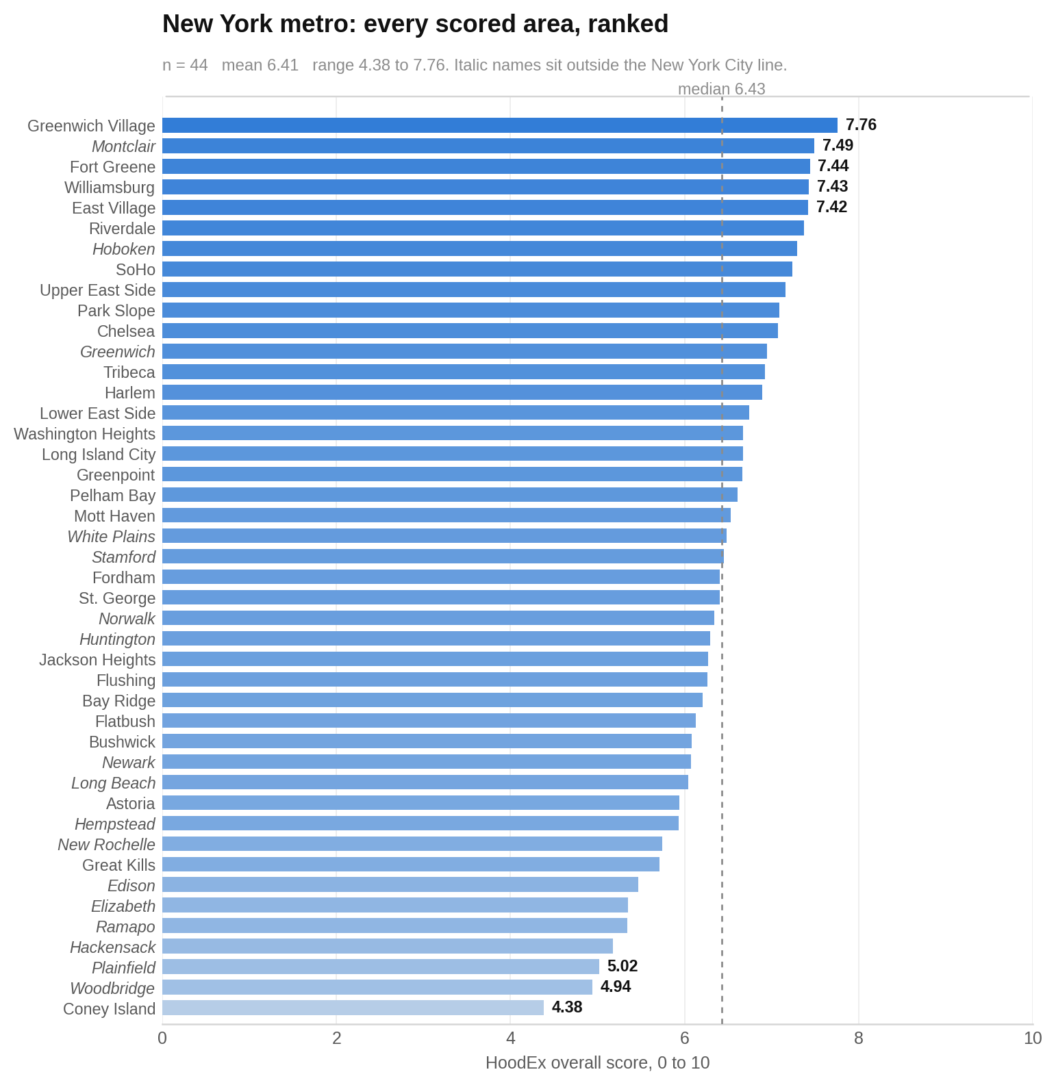
Greenwich Village comes first at 7.76. Its social-life pillar reaches 9.85, the highest in this metro sample. Montclair follows at 7.49, powered instead by nature at 7.80 and buildings at 7.65.
The chart below shows all 44 published overall scores. Each bar represents one area, and a longer bar means a higher overall score. Names in italics are outside New York City. Look at the top of the ranking: strong city areas and strong suburban areas can reach similar territory by taking completely different routes.
The 12 highest overall scores
| Area | Score |
|---|---|
| Greenwich Village | 7.76 |
| Montclair | 7.49 |
| Fort Greene | 7.44 |
| Williamsburg | 7.43 |
| East Village | 7.42 |
| Riverdale | 7.37 |
| Hoboken | 7.29 |
| SoHo | 7.24 |
| Upper East Side | 7.16 |
| Park Slope | 7.09 |
| Chelsea | 7.07 |
| Greenwich | 6.95 |
Green space means something different on each side of the line
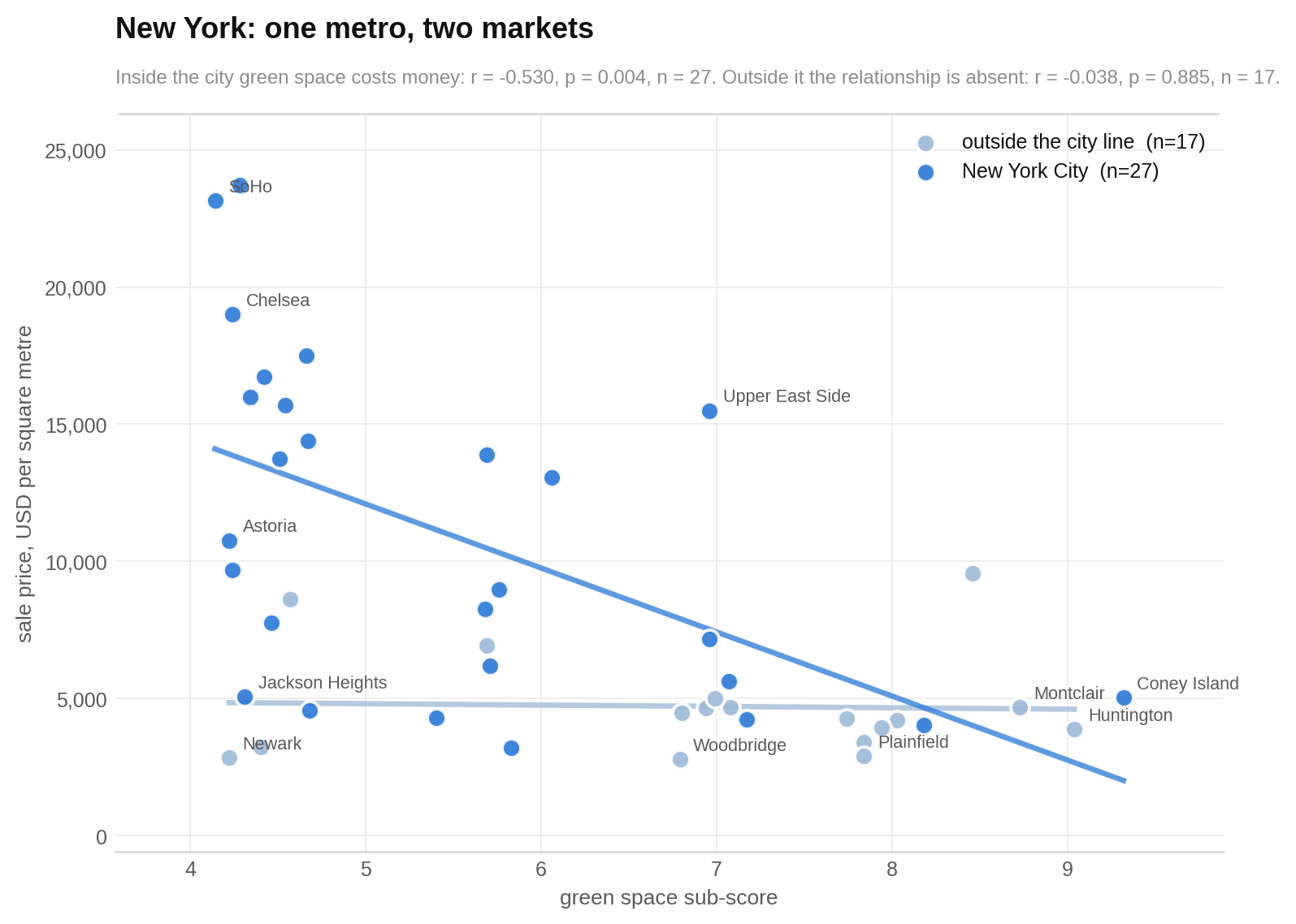
If you are shopping inside New York City, greener areas tend to have lower sale prices in this dataset. Outside the city, the report found no evidence that green space predicts price. With only 17 outside areas, that smaller sample cannot rule out a moderate relationship.
The chart plots green space against sale price. Each dot is one area. Farther across the chart means more green space, while higher means a higher price per square metre. Separate trend lines are drawn for the city and the areas outside it. Watch the city line slope downward while the outside line stays almost flat.
City living buys social life and connections; the suburbs buy nature and balance
The biggest practical divide is not the buildings. It is the life around them.
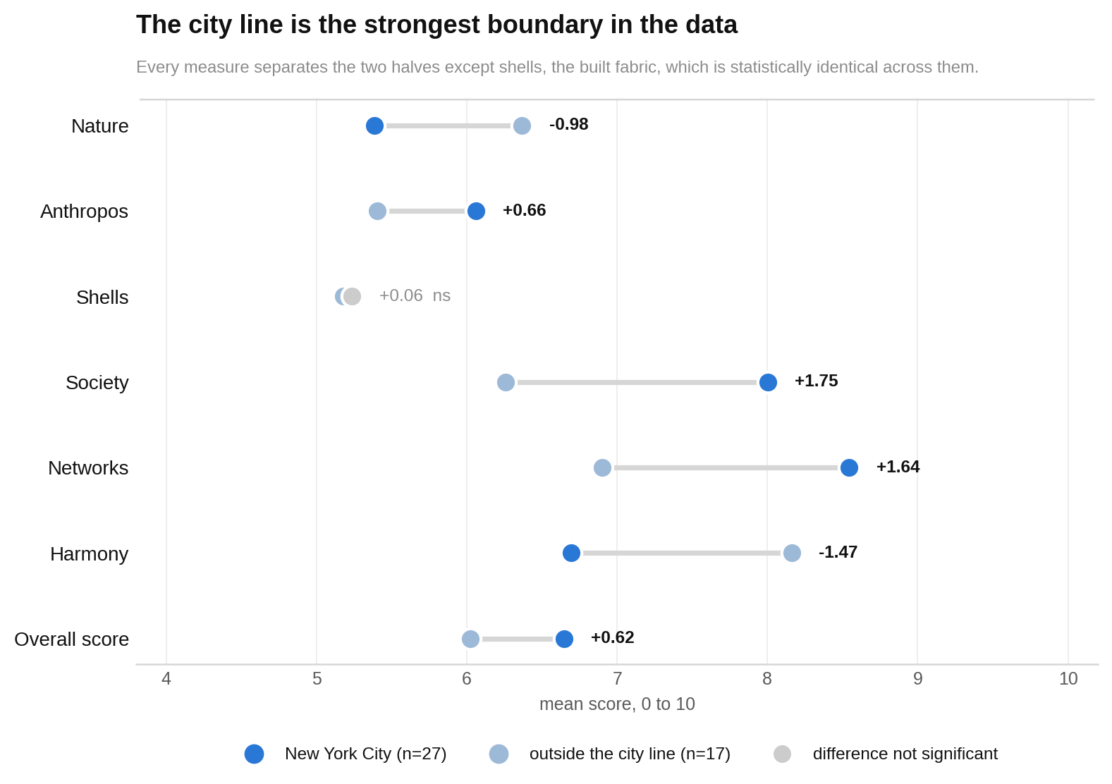
Areas inside the city average 6.65 overall, compared with 6.02 outside. Their society score is 8.00 against 6.26, and their networks score is 8.54 against 6.90. Outside areas lead on nature, 6.37 against 5.39, and harmony, 8.16 against 6.70.
The built-fabric scores sit in the same broad band: 5.24 inside and 5.18 outside. The sample found no evidence of a city–suburb difference in this pillar, though that does not prove no difference exists.
The chart compares the average overall score, harmony and five pillars. Each pair of bars shows the city beside the outside areas; taller bars mean higher scores. Look for the wide gaps in society, networks, nature and harmony, then the nearly level pair for buildings.
Balance tells you where a neighbourhood is, not how good it is
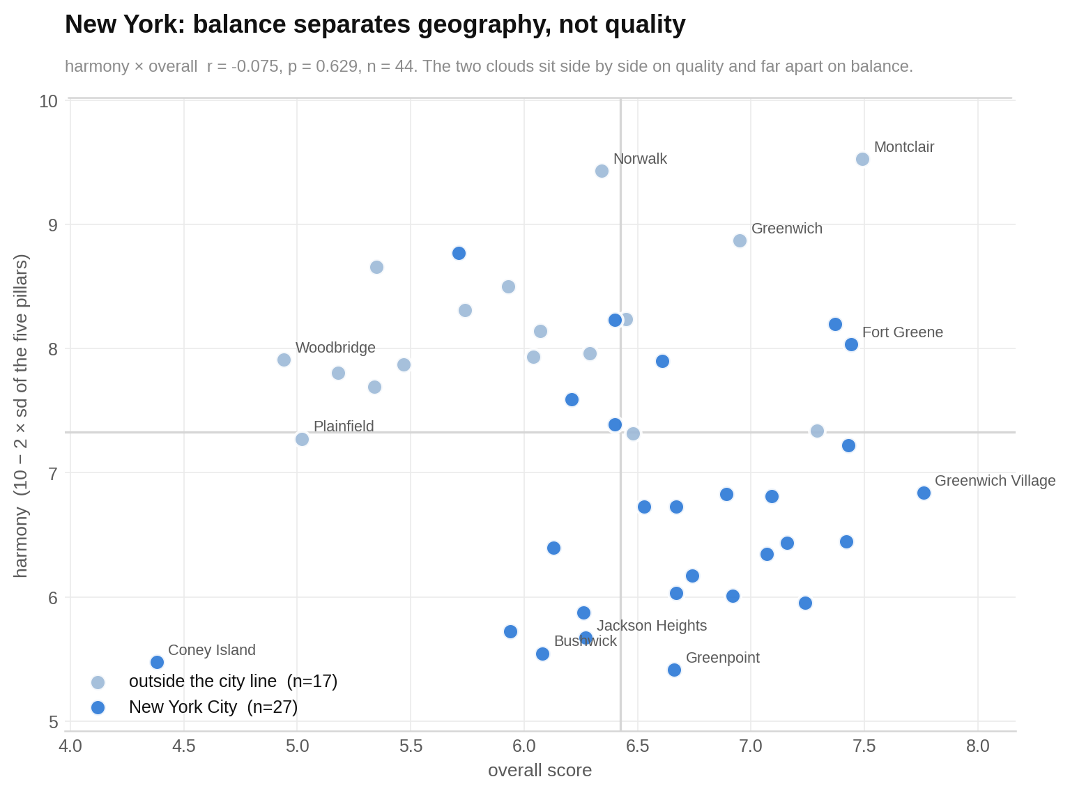
A high harmony score sounds like an automatic virtue. In New York, it is better read as a clue that an area is suburban.
Montclair has harmony of 9.52 and Norwalk 9.43. Greenpoint, Coney Island, Bushwick and Jackson Heights sit at the low end, from 5.41 to 5.67. Three of the four most even areas are outside the city. All four of the least even are inside it.
The chart puts overall quality against harmony. Each dot is an area, and its colour shows which side of the city line it sits on. Higher means a stronger overall score; farther across means a more even set of pillars. Look for two groups separated mainly by balance rather than by quality.
The market pays most clearly for life on the pavement
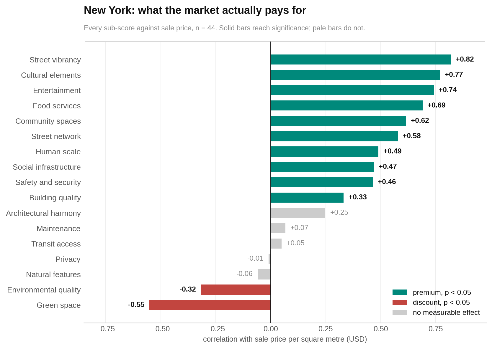
In this dataset, street vibrancy has the strongest relationship with sale price. Culture, entertainment and food services also matter. Building quality offers a much weaker signal that does not survive all of the report’s checks.
SoHo and the Lower East Side share the highest street-vibrancy score, at 9.4. Elizabeth and Coney Island share the lowest, at 1.0. Prices across those two pairs differ by roughly seven to one.
The chart compares every detailed sub-score with sale price per square metre. Bars pointing in one direction mean higher scores tend to accompany higher prices; bars pointing the other way mean higher scores tend to accompany lower prices. Solid bars passed the report’s significance threshold and pale bars did not. The main pattern to notice is that visible street life stands far ahead of building condition.
Six areas combine above-median scores with below-median prices
Montclair, Mott Haven, Pelham Bay, Riverdale, Stamford and White Plains sit above the metro’s middle overall score while remaining below its middle sale price.
HoodEx calls this the hidden-value group. It is not a buying recommendation. It simply means measured fundamentals currently sit ahead of the price bracket in this sample.
The chart divides areas at an overall score of 6.43 and a sale price of $5,913 per square metre. Each dot is one area. Higher means a better overall score and farther across means a higher price. Look in the high-score, lower-price section for the six places where those two measures disagree in a potentially useful way.
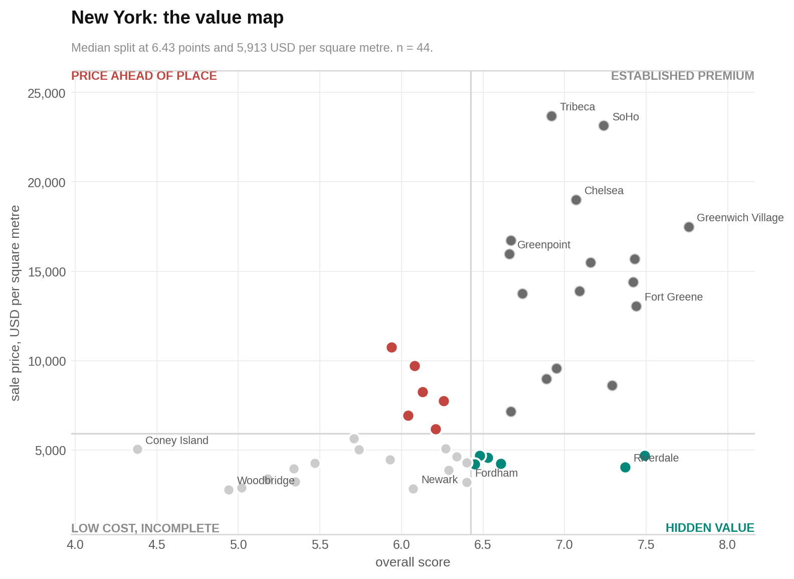
6 areas — sit in the hidden-value quadrant (This is a comparison of scores and supplied sale prices, not investment advice.)
The new weighting fixed social life, but not every scoring problem
Food services and entertainment originally counted for nothing in the supplied export. HoodEx restored them before calculating this report. The average score moved only slightly, but 41 of the 44 areas changed rank.
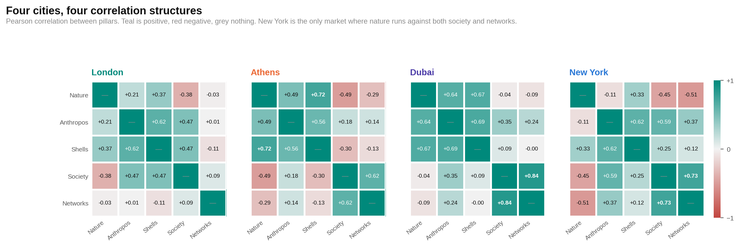
Three problems remain. Climate comfort carries a large weight despite barely changing across the metro. Street vibrancy and food services overlap so closely that ground-floor activity is partly counted twice. Nature also pulls against both society and networks in New York, a pattern not seen in the other three markets shown.
The chart is a grid of pillar relationships across four markets. Each coloured cell pairs two pillars; the colour shows whether they tend to rise together or move in opposite directions, and stronger colour means a stronger relationship. Focus on New York’s nature row: it is the only market where nature runs against both social life and movement.
The street score works better than the transit score
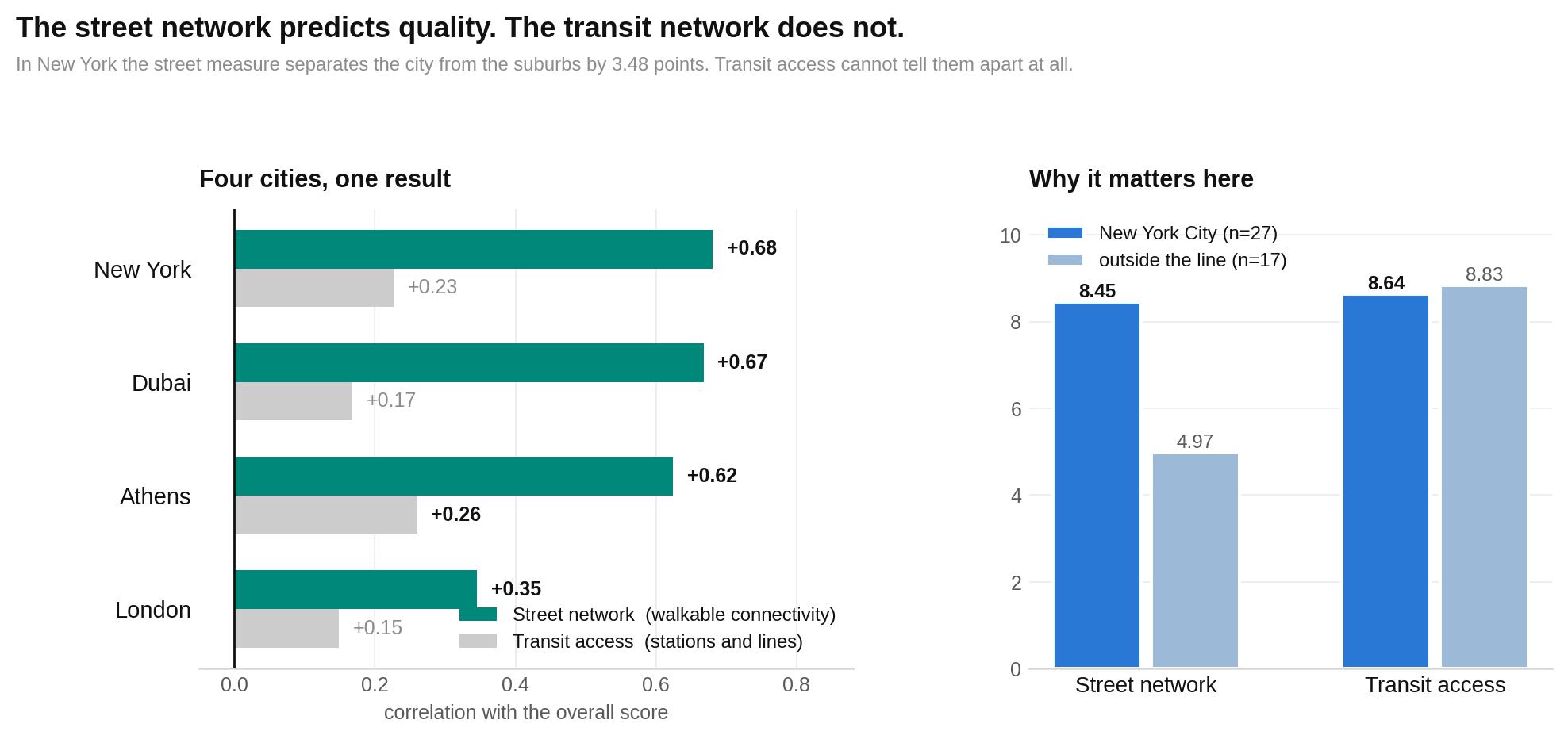
If you want to understand how connected a New York area feels, the street pattern tells this report more than its transit-access measure does.
The street-network score averages 8.45 inside the city and 4.97 outside. Transit access goes the other way by a tiny amount, rating the outside areas at 8.83 and the city at 8.64. The report found no evidence of a meaningful city–suburb transit difference.
The chart first compares how street connectivity and transit access relate to overall quality in four markets. It then shows the New York city–suburb averages. Longer bars mean a stronger relationship or a higher average, depending on the panel. Notice how clearly the street half separates the city from the suburbs while the transit half barely moves.
Human scale is the most stable measure tested so far
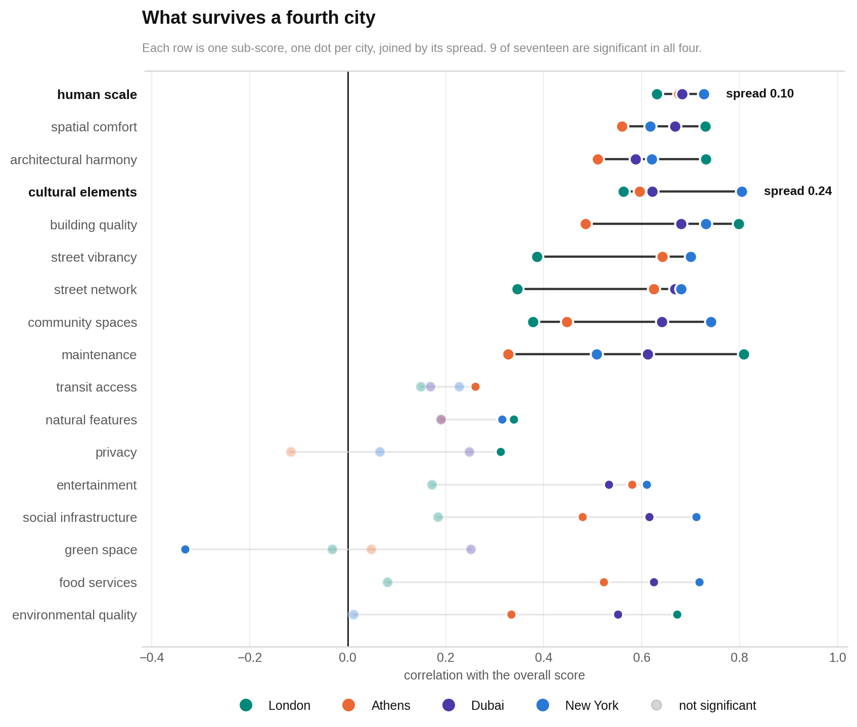
Places built to the size of a person tend to receive stronger overall scores. That pattern appears in New York and in the three other markets compared in the report.
Within New York, it also appears separately inside and outside the city line. Even so, four markets are not enough to call the pattern universal. Similarity can also come partly from using the same scoring framework and weights.
The chart gives each shared sub-score one row. Each dot represents a city, and dots farther toward the strong-positive end show a closer relationship with the overall score. Lines join the four cities to reveal the spread. Look for human scale’s short, consistently positive line.
Air quality only helps separate the suburbs
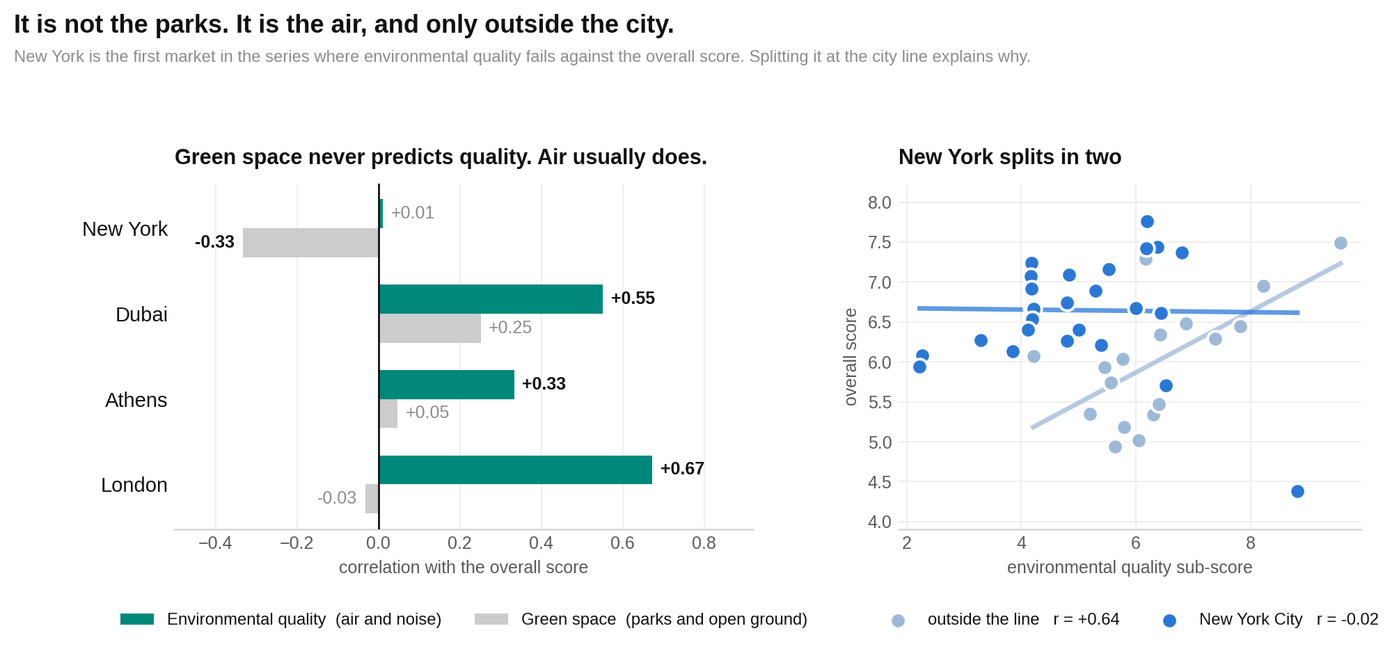
Across the whole metro, environmental quality does not predict the overall score. The split explains why.
Outside New York City, areas with better environmental quality tend to score better overall. Inside the city, this sample found no evidence of a relationship. The report says the city areas cluster near the top of the environmental-quality range, leaving too little variation for the measure to distinguish them.
The chart compares green space and environmental quality with overall scores across four markets, then opens New York into its city and outside groups. Each point represents a market or area, depending on the panel; higher overall scores sit higher, while better environmental measures sit farther across. Look for the outside-New York slope in environmental quality and the flat city pattern.
The boundary lesson: A metro-wide average can look like a rule even when the relationship exists only inside New York City.
Who each area suits best
No score can tell you where you will feel at home. It can narrow the search. These matches use only the strengths, prices and market findings reported in this edition.
| If you are… | Look at… | Why |
|---|---|---|
| Looking for strong social life and connected streets | Greenwich Village, Fort Greene, Williamsburg, East Village, SoHo | Each has a society score above 9.0. Their networks scores range from 7.50 to 9.60, and all sit near the top of the overall ranking. |
| Looking for nature without leaving the stronger overall-score band | Montclair, Riverdale, Greenwich | Their nature scores are 7.80, 7.32 and 7.62. Their overall scores range from 6.95 to 7.49. |
| Looking for a more even suburban mix | Montclair, Norwalk, Greenwich | They are three of the four most harmonious areas, with harmony from 8.87 to 9.52. Remember that harmony describes balance, not guaranteed quality. |
| A value hunter comparing price with measured fundamentals | Montclair, Mott Haven, Pelham Bay, Riverdale, Stamford, White Plains | All six score at or above the metro median while their supplied sale prices sit below the price median. |
| Focused on gross rental yield | Newark, Riverdale | They have the two highest reported gross yields, at 10.13% and 9.81%. Higher yield generally sits away from the qualities receiving the strongest price premium. |
| Choosing for schools or child-specific services | No evidence-based match in this edition | The report does not include school quality, childcare, bedroom mix or child-specific safety measures, so it cannot support a family recommendation. |
| A student choosing around a campus | No evidence-based match in this edition | The data does not include campus locations, student rents or commute times to colleges. |
Why 15 familiar names are missing
Bayside, Brooklyn Heights, Crown Heights, Far Rockaway, Financial District, Forest Hills, Islip, Jamaica, Jersey City, Midtown, Mount Vernon, New Brunswick, Paterson, Upper West Side and Yonkers are not ranked.
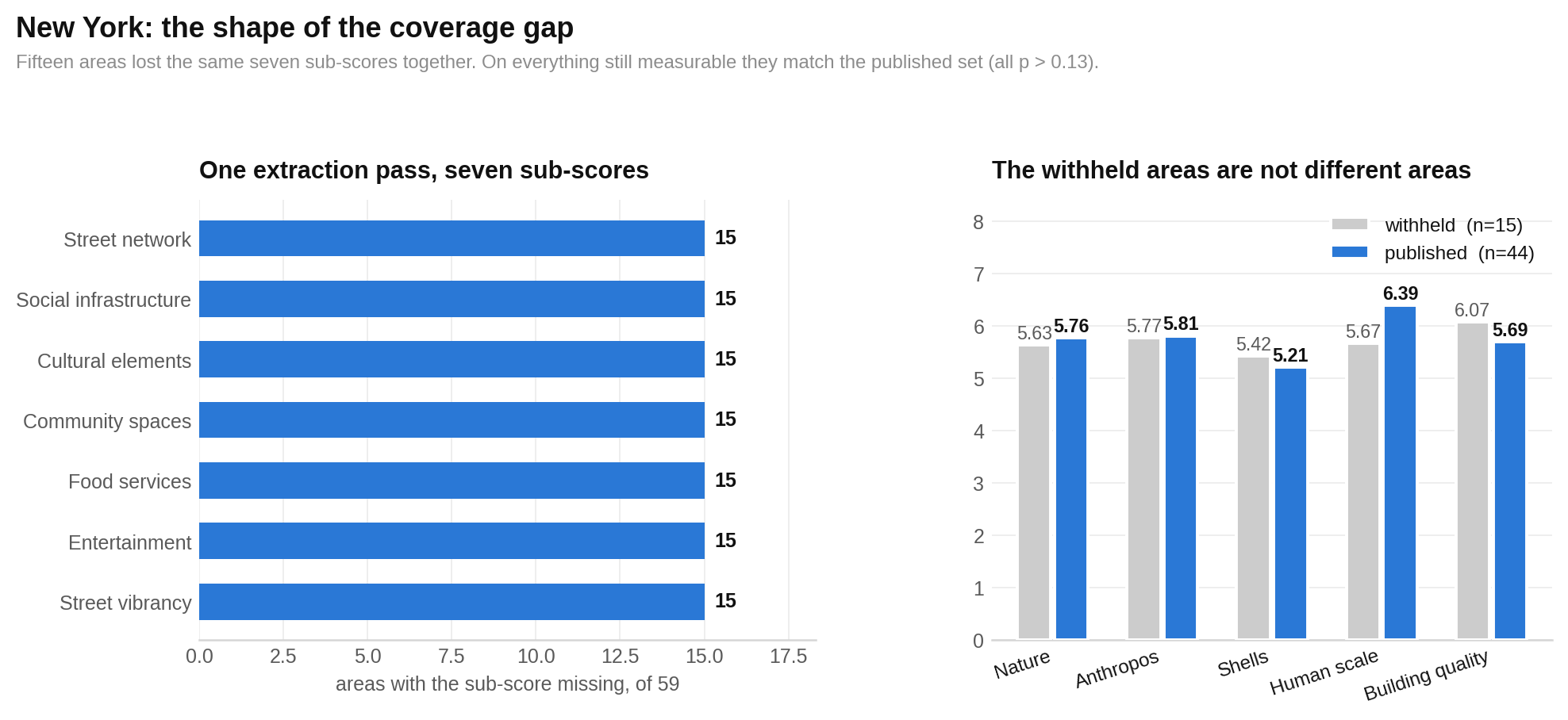
One extraction pass lost the same seven details for all 15 areas. Their society pillar was left with safety alone, while their networks pillar was left with transit alone. Dropping those incomplete pillars left each area below the minimum needed for an overall score.
The chart shows what disappeared and compares the withheld group with the published group on what remains. Bars represent group averages, with taller bars meaning higher scores or prices. Most pairs are close. Transit access is the exception. The pattern supports treating this as a data failure rather than evidence that the missing areas are weaker.
The bottom line
Start your New York search by deciding which side of the city line fits the life you want.
Inside the city, the typical bargain is more social life, stronger street connections and a higher overall score, but less nature and a more lopsided mix of strengths. Outside it, the typical bargain is more greenery and balance, with less of the street activity that the market rewards most strongly.
Do not use the metro average blindly. Green space, culture and street connectivity have different price relationships on the two sides of the boundary.
And do not mistake balance for quality. Montclair shows that an area can offer both, but harmony alone mostly tells you that a place feels suburban. For practical shopping, compare the five pillars, the supplied price and the side of the city line before looking at rank.
The fine print
Sample and ranking
The export supplied 59 areas across 12 counties in New York, New Jersey and Connecticut. Forty-four received published overall scores: 27 inside New York City and 17 outside. Fifteen were withheld. The published overall mean is 6.405, with standard deviation 0.776 and range 4.38 to 7.76. Thirty-three areas score at least 6.0 and 11 at least 7.0.
Coney Island ranks last at 4.38 but is flagged. Its nature score is 7.60 and its society score is 0.73 on 0.75 coverage, with entertainment, cultural elements and social infrastructure recorded as exactly zero and safety missing. No headline depends on it.
City line tests
Green space against sale price: inside the city r = -0.530, p = 0.005, n = 27, with Spearman rho = -0.611; outside r = -0.038, p = 0.885, n = 17; pooled r = -0.552, p < 0.001. Cultural elements against price: inside r = +0.776, p < 0.001; outside r = +0.330, p = 0.195. Street network against price: inside r = +0.408, p = 0.034; outside r = +0.214, p = 0.410. Street vibrancy against price: inside r = +0.789; outside r = +0.518, p = 0.033. It is the only reported price relationship significant on both sides.
Welch tests comparing inside with outside give: overall 6.65 versus 6.02, difference +0.62, p = 0.010; harmony 6.70 versus 8.16, difference -1.47, p < 0.001; nature 5.39 versus 6.37, difference -0.98, p = 0.002; anthropos 6.06 versus 5.40, difference +0.66, p = 0.025; shells 5.24 versus 5.18, difference +0.06, p = 0.863; society 8.00 versus 6.26, difference +1.75, p < 0.001; networks 8.54 versus 6.90, difference +1.64, p < 0.001. Each group comparison uses n = 27 and n = 17. Mann-Whitney agrees on every row.
Harmony
Harmony against overall: pooled r = -0.075, p = 0.629, n = 44, with Spearman rho = -0.115; inside r = +0.216, p = 0.280, n = 27; outside r = +0.385, p = 0.127, n = 17. These null results are not proof that no relationship exists; the split samples cannot rule out moderate relationships. Harmony against sale price is r = -0.566, p < 0.001 pooled, r = -0.409, p = 0.034 inside and r = +0.099, p = 0.706 outside. Because harmony and price both track the boundary, the report draws no preference claim from the pooled result. Balanced Excellence is withheld.
Price, rent and yield
Street vibrancy against sale price is r = +0.819, p < 0.001, n = 44, Spearman rho = +0.825, and r = +0.806 after removing the two largest outliers. Cultural elements gives r = +0.770, entertainment +0.741 and food services +0.690. Building quality gives r = +0.331 but fails Spearman confirmation and outlier removal, so it is treated only as a direction. Green space gives r = -0.552, p < 0.001.
Gross yield against overall is r = -0.343, p = 0.023, and against society r = -0.514, p < 0.001. Reported yields range from Newark at 10.13% and Riverdale at 9.81% to Tribeca at 3.29% and Long Island City at 3.37%. The value quadrants use an overall median of 6.43 and a supplied sale-price median of $5,913 per square metre.
Sale and rent figures came with the export. The export gives no source, collection method or transaction count. Price provenance is unresolved. Dates range from January 2025 to June 2026, yet the report compares the figures as if contemporaneous. Jamaica has no price or rent data. This report is measurement, not investment advice.
Weighting and score construction
The supplied export used an older society scheme in which food services and entertainment had zero weight. Constrained non-negative least squares reproduced that scheme with root mean square error 0.0025 and returned both weights at 0.000. The published version restores food services to 0.15 and entertainment to 0.10. The society mean changes from 7.245 to 7.329 and the overall mean from 6.355 to 6.405. Forty-one of 44 areas change rank. Under the published weights, food services against overall is r = +0.718 and entertainment is r = +0.610. Every headline keeps its direction under both schemes.
Climate comfort carries weight 0.30 in anthropos but has standard deviation 0.168 and range 6.03 to 7.16. Removing it widens the anthropos standard deviation from 0.876 to 1.258, or 43.7%. Street vibrancy and food services correlate at r = +0.931; street vibrancy against the society pillar is +0.877. This creates cross-pillar double counting. Privacy is exactly 4.0 in 29 of 59 areas and exactly 5.0 in another 13. Social infrastructure is exactly 10.00 in 23 of the 44 published areas. Maintenance, building quality and architectural harmony use only 9, 6 and 7 distinct values across the 59 supplied areas.
Networks, human scale and environmental quality
Street connectivity against overall is r = +0.681, p < 0.001, n = 44. Transit access is r = +0.227, p = 0.139. The two network halves correlate at r = +0.042, p = 0.787. Street connectivity averages 8.45 inside and 4.97 outside, a 3.48-point gap at p < 0.001. Transit access averages 8.64 inside and 8.83 outside, a 0.19-point difference at p = 0.624.
Street connectivity against overall is +0.345 in London, +0.625 in Athens, +0.668 in Dubai and +0.681 in New York. Transit access gives +0.149, +0.260, +0.168 and +0.227. The two network halves correlate at +0.079, +0.056, +0.199 and +0.042 in those markets.
Human scale against overall gives +0.631 in London, +0.676 in Athens, +0.683 in Dubai and +0.727 in New York, a spread of 0.096 across 210 neighbourhoods. All have p < 0.001, Spearman confirmation and survival of outlier and flagged-row removal. Within New York it is r = +0.642 inside and r = +0.748 outside. Nine of 17 shared sub-scores are significant in all four cities. These results remain scoped to four markets scored under the same framework; they do not establish a universal rule.
Environmental quality against overall is r = +0.011, p = 0.941, n = 44 pooled; r = +0.636, p = 0.006, n = 17 outside; and r = -0.017, p = 0.933, n = 27 inside. Comparable pooled values are +0.672 in London, +0.551 in Dubai and +0.333 in Athens. Green space against overall in New York is r = -0.332, p = 0.028, but Spearman gives rho = -0.186, so the report treats it only as a direction.
Coverage failure
The 15 withheld areas lost street vibrancy, all five point-of-interest society components and the street-network measure in the same extraction pass. Their remaining society score was safety alone and their remaining networks score was transit alone. Dropping both pillars left only three qualifying pillars, below the required four.
Withheld versus published averages are: nature 5.63 versus 5.76; anthropos 5.77 versus 5.81; shells 5.42 versus 5.21; green space 6.19 versus 6.06; building quality 6.07 versus 5.69; human scale 5.67 versus 6.39; and sale price $8,398 versus $8,577 per square metre. Their p values range from 0.140 to 0.922. Transit access differs at 7.34 versus 8.71, p = 0.013. New Brunswick also has nature coverage of 0.67 because natural features are missing.
Robustness checks and open flags
Every headline relationship was run under Pearson and Spearman, with the two largest outliers removed and with flagged areas removed. Excluding Coney Island moves society against overall from +0.826 to +0.791, street network against overall from +0.681 to +0.615, human scale against overall from +0.727 to +0.750 and green space against price from -0.552 to -0.552. The conclusions do not change.
Open flags are the 15-area coverage failure, Coney Island’s society data, cross-pillar double counting, the near-constant climate-comfort measure, default-heavy privacy values, the social-infrastructure ceiling, coarse shells data, the three-state metro boundary, unresolved price provenance, mixed price dates, missing Jamaica prices, incomplete nature data for New Brunswick and the society-version boundary.
Methodology · All HoodEx Research · Explore New york neighborhoods