London’s best-value neighbourhoods are hiding beyond the centre
London scores well across the board, but green space, nightlife and housing cost pull home hunters in very different directions.
Step out in Highgate and the city can feel leafy and hushed. Walk through Covent Garden and the pavement becomes the main event. Restaurants, theatres and crowds fill the scene. Both are London. They simply offer different versions of it.
That is the lesson from HoodEx’s study of 40 London neighbourhoods. The scores are packed tightly together. The prices are not. Choosing an area is less about finding a good place and more about deciding which trade-offs you can live with.
The short version
- London has a high floor. All 40 measured areas score between 6.52 and 8.42 out of 10. The full gap is only 1.90 points.
- If you want greenery, expect fewer restaurants and less nightlife. Green space moves sharply in the opposite direction to food, entertainment and busy streets.
- Buildings separate neighbourhoods more than transport does. Building condition varies widely. Getting around scores well in most places and does little to explain the ranking.
- The strongest value is mostly outside central London. Kingston upon Thames, Greenwich, Canary Wharf and Bromley lead the value list.
- Culture carries a large price premium. Of the individual measures studied, cultural elements have the strongest link with sale price.
- Do not choose from the overall rank alone. Two areas with similar totals can offer opposite daily experiences.
How HoodEx scores a neighbourhood
The method starts with the ideas of Greek planner Constantinos Doxiadis. His Ekistics framework treats a settlement as five things at once: nature, people, social life, buildings and movement.
HoodEx turns those ideas into five plain-language pillars. They are green space and environment, street life and human scale, buildings and upkeep, amenities and community, and getting around. Each pillar receives a score from 0 to 10. Higher is always better.
The overall score is the average of the pillars with enough data. Each pillar counts equally. That choice is useful, but it is not personal. If transport matters far more to you than nightlife, read the transport score rather than treating the overall number as your answer.
The scale is not curved to make London produce winners and losers. A 7 means the same thing in each neighbourhood. That helps explain why every measured London area lands in a relatively narrow band.
HoodEx also calculates harmony. This asks how even the five pillars are, not how high they are. A place that is fairly good at everything receives more harmony than one carried by a brilliant high street and held back by poor greenery. The value score is different again. It combines 65% quality with 35% lower sale price. It describes today’s numbers. It is not a forecast or investment advice.
A ranking where nobody runs away
The first chart places all 40 neighbourhoods in overall-score order. Each bar is one area, and a longer bar means a higher score. Look at how little space separates the first and last bars. Hampstead leads, but the whole field fits inside 1.90 points. That means category profiles matter more than a difference of a few ranking places.
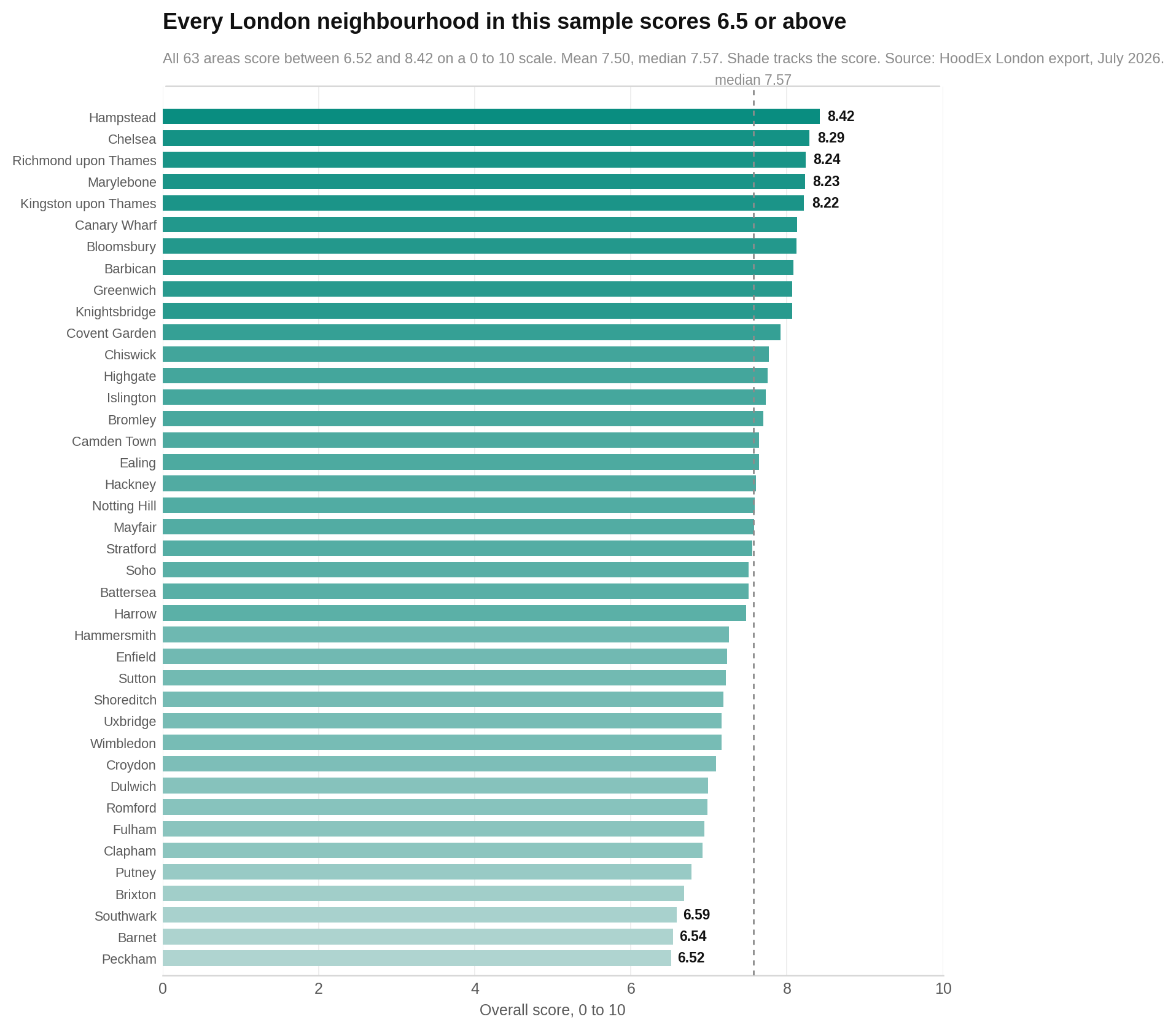
The ten highest overall scores
| Area | Score |
|---|---|
| Hampstead | 8.42 |
| Chelsea | 8.29 |
| Richmond upon Thames | 8.24 |
| Marylebone | 8.23 |
| Kingston upon Thames | 8.22 |
| Canary Wharf | 8.13 |
| Bloomsbury | 8.12 |
| Barbican | 8.08 |
| Knightsbridge | 8.07 |
| Greenwich | 8.07 |
The overall score hides five different Londons
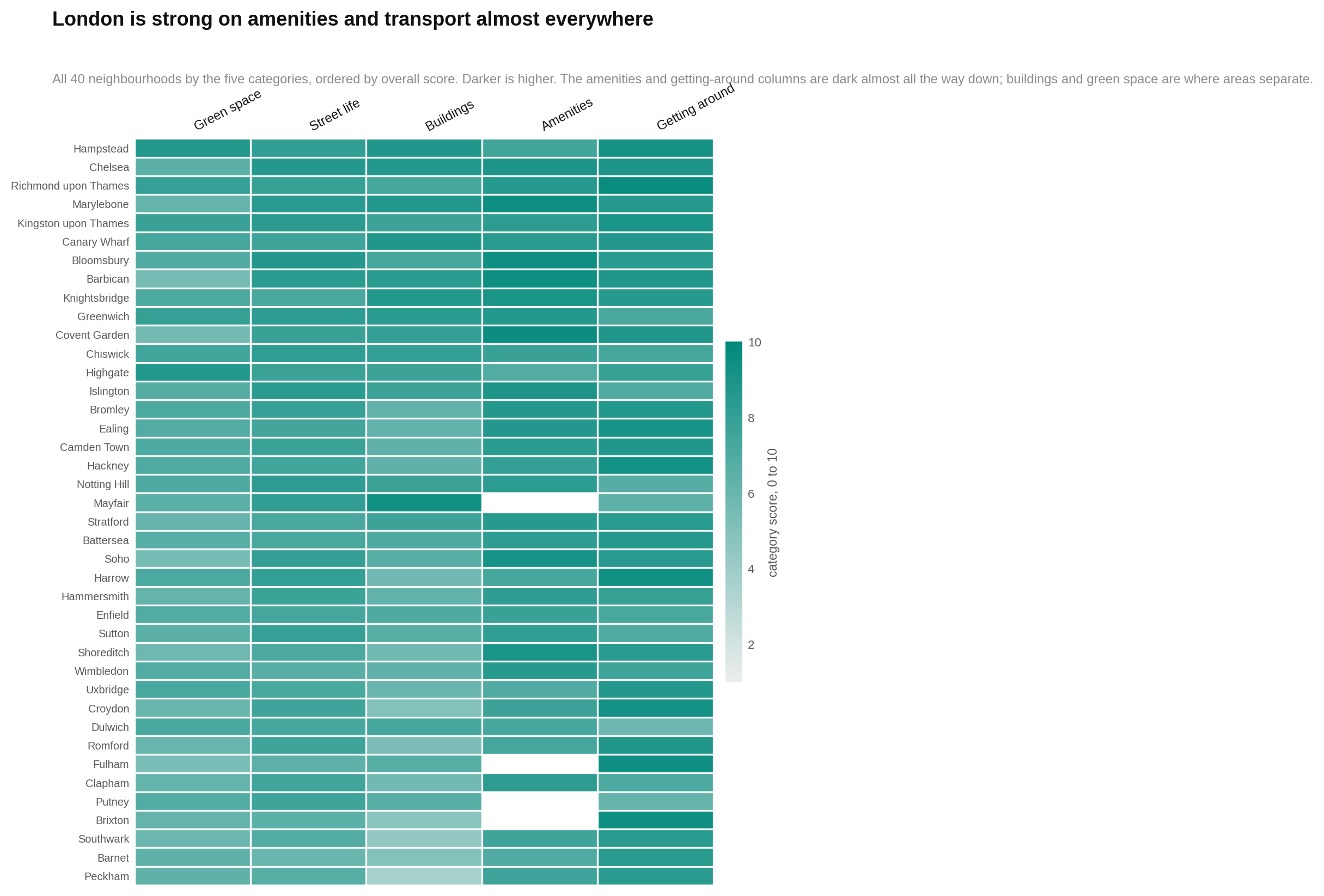
If you are choosing where to live, the five pillars tell you more than the final rank. This chart gives every area a row and every pillar a column. Darker cells mean higher scores. Read across a row to see what an area is good at. Read down a column to compare one feature across London.
Look for the uneven rows. Central districts often turn dark around amenities and street life but pale around greenery. Several outer areas reverse that pattern. A similar overall score can therefore hide a very different day-to-day life.
Buildings create the biggest gaps
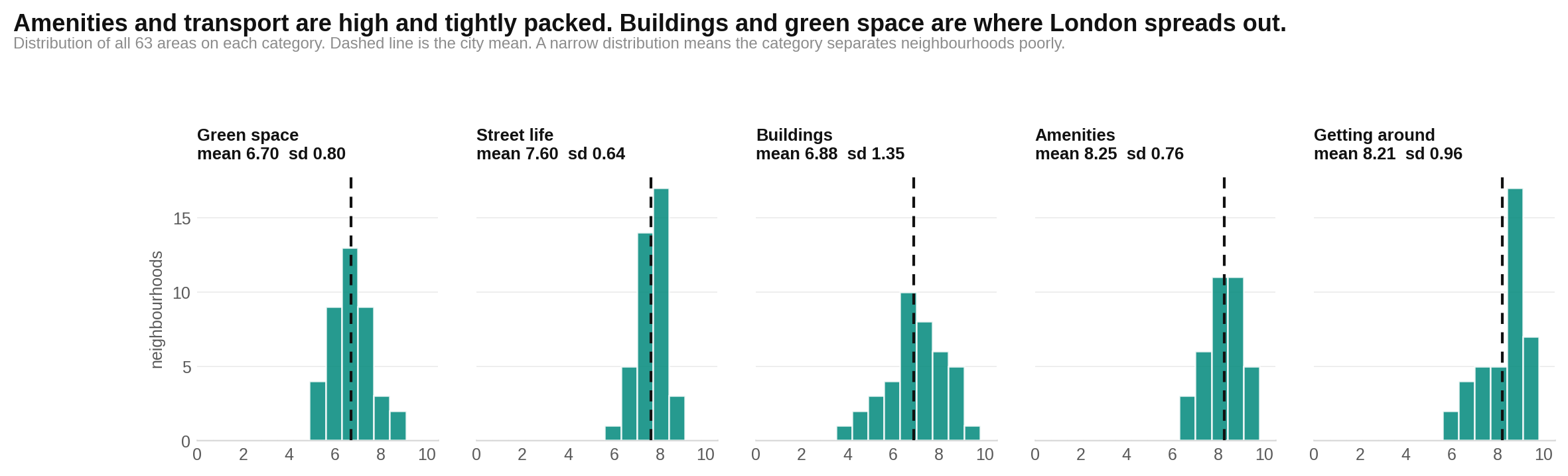
London’s neighbourhoods differ most in their buildings and upkeep. This chart shows how scores in each pillar are spread across the city. Each mark represents an area. Farther across the scale means a higher score, while a wider cloud means the pillar separates places more clearly.
Watch the buildings column. It stretches from 3.65 to 9.35, much farther than the other pillars. Transport is more compressed and scores highly in much of the city. That makes it important in daily life but less useful for telling these neighbourhoods apart.
A better building usually means a higher score — and a higher price
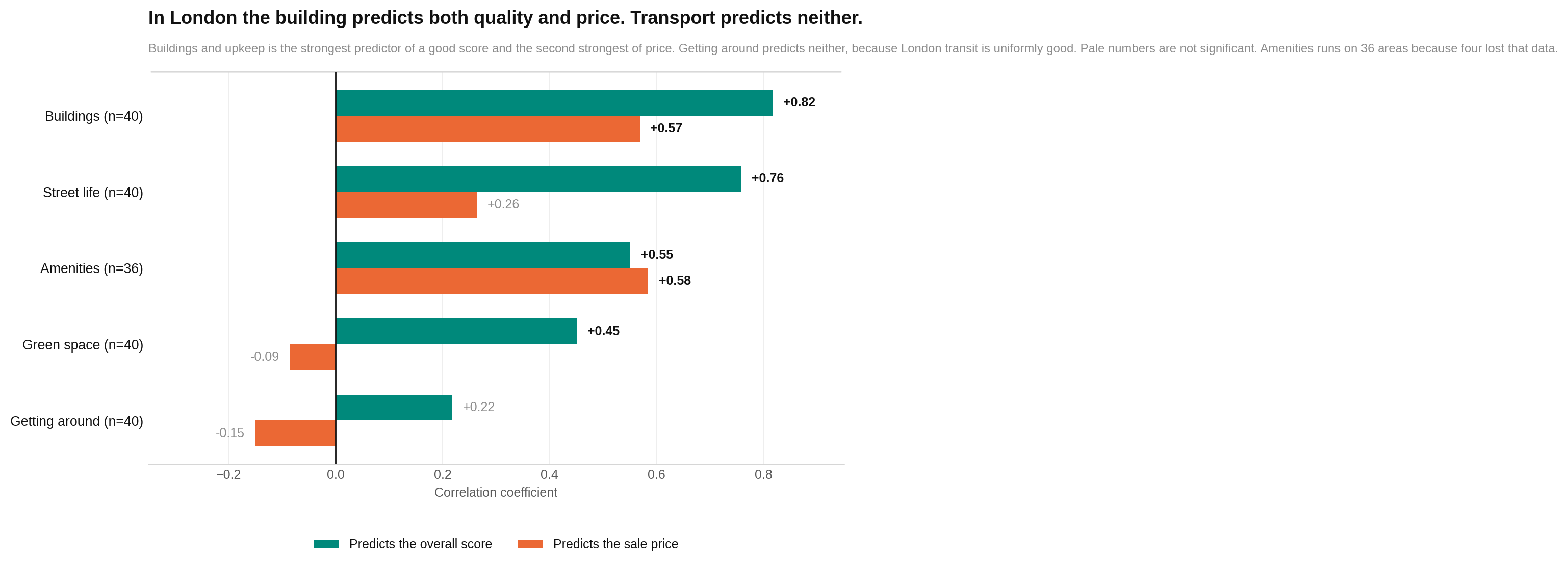
If you want one quick clue to measured neighbourhood quality, look at buildings and upkeep. It has the clearest relationship with the overall score. It is also closely associated with sale price.
This chart compares each pillar twice: once with overall quality and once with price. The direction shows whether the measures rise together or move apart, and the size of the mark shows how closely they travel. Look for the near reversal in the order. Greenery helps explain quality but not price. Amenities and buildings are much more visible in the market.
The same total can buy opposite lifestyles
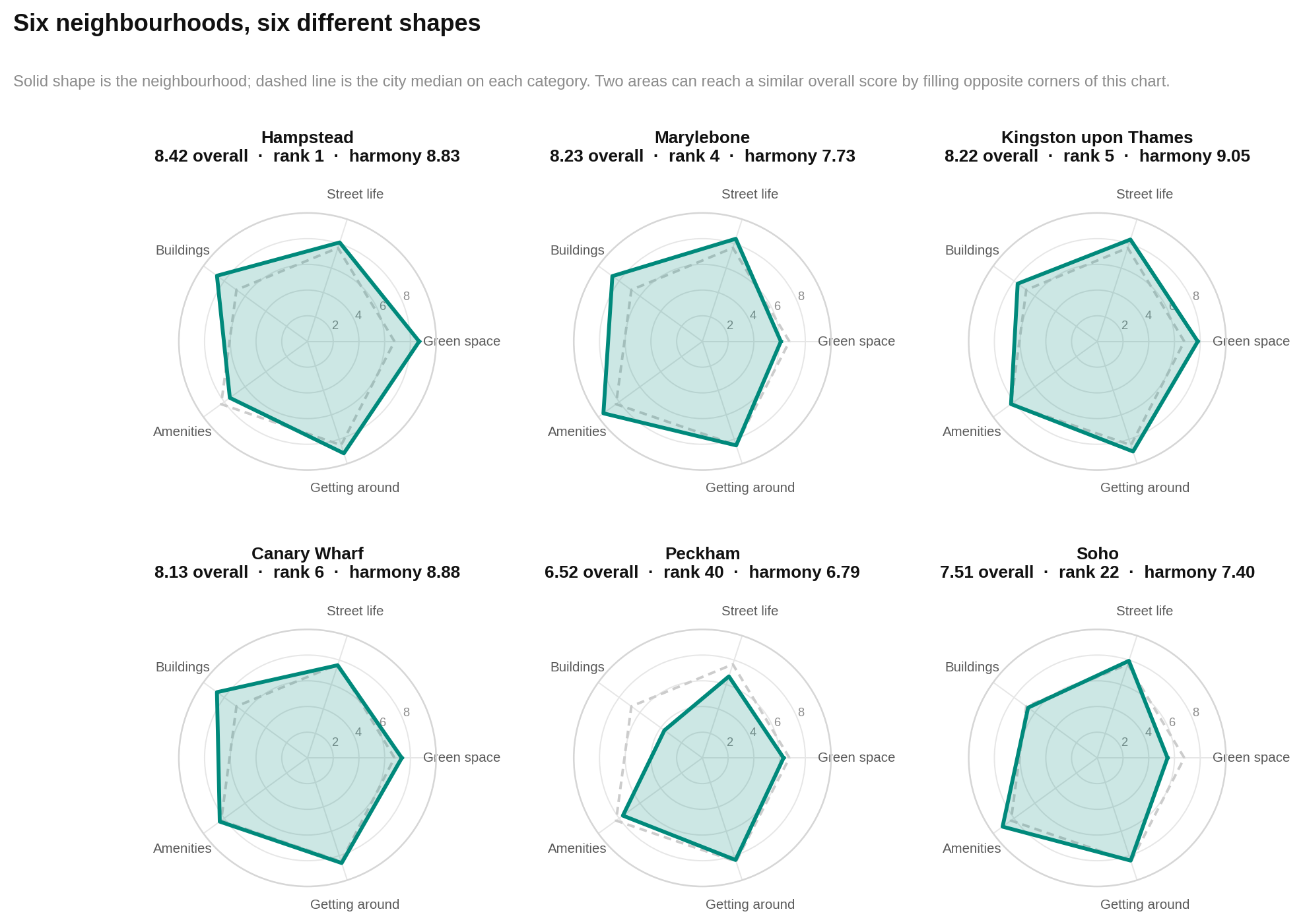
Marylebone and Kingston upon Thames sit in the same broad high-scoring band, but they do not feel like interchangeable choices. Marylebone is led by amenities and held back by greenery. Kingston upon Thames is more even and costs far less.
The next chart shows six neighbourhoods against the city median. Each spoke is one pillar. The solid shape belongs to the neighbourhood and the dashed outline is the London median. Farther from the centre means a higher score. Look at the shape, not just its size: spikes reveal strengths and dents reveal the compromise.
Balance may rise with quality, but the evidence is fragile
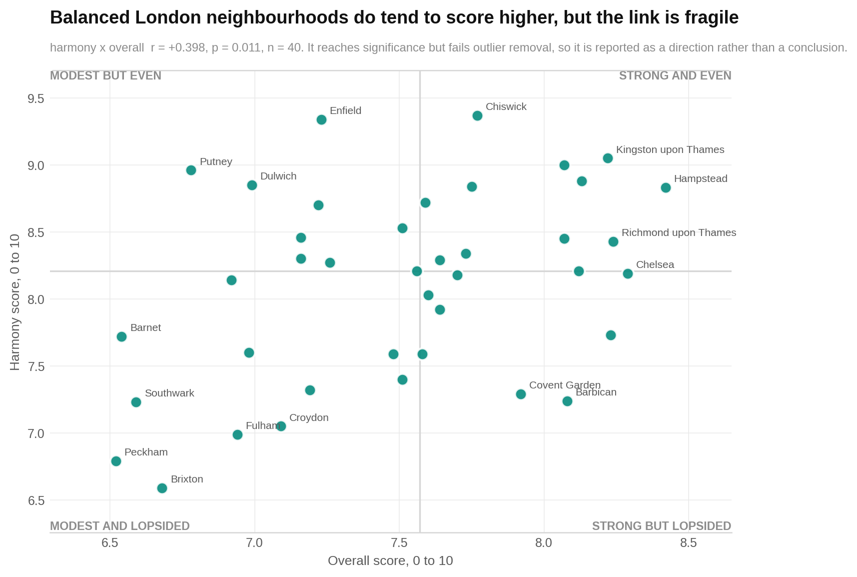
London’s stronger-scoring areas also tend to look a little more balanced. The sample is too small, and the pattern too dependent on two unusual areas, to treat that as a firm rule.
In this chart, each dot is a neighbourhood. Moving right means a higher overall score. Moving up means a more even mix across the five pillars. The dots lean upward, but not tightly. The useful lesson is modest: quality and balance answer different questions, and neither should replace the other.
Chiswick is the most even, not the highest scoring
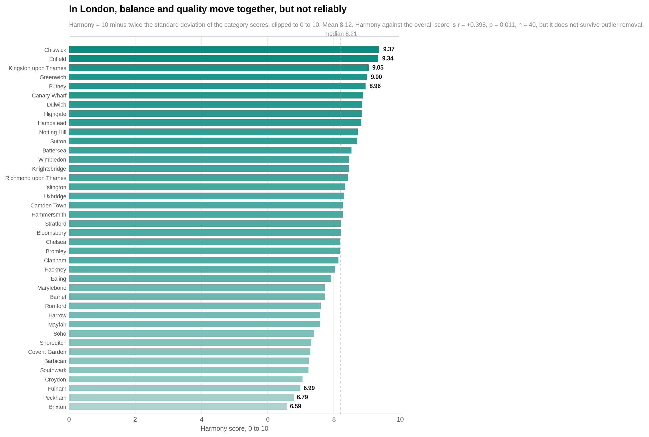
If you dislike serious weak spots, Chiswick deserves attention. Its harmony score is 9.37, the highest reported. Enfield follows at 9.34, despite sitting below the city median on overall quality. Kingston upon Thames and Greenwich combine high harmony with high overall scores and relatively low prices.
The chart orders areas by harmony rather than quality. Longer bars mean the five pillars are more even. Do not read a long bar as proof of higher quality: an area can be consistently moderate. Notice how this ordering differs from the main leaderboard.
The supplied figure says it contains 63 areas, while the report’s stated London analysis and leaderboard contain 40. That internal mismatch is unresolved and is flagged again in the fine print.
London’s scores are close; its prices are not
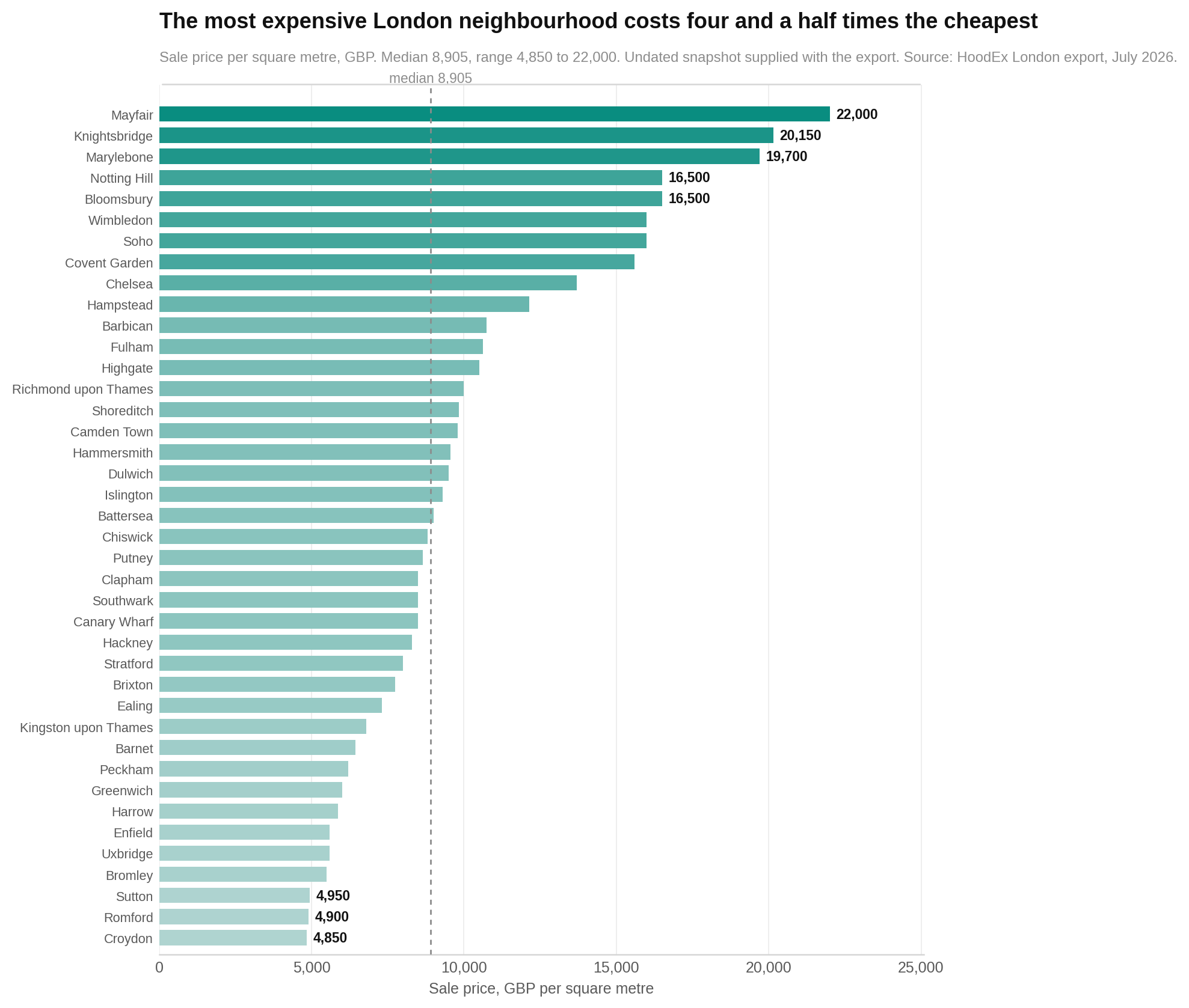
The cheapest measured area is Croydon at £4,850 per square metre. The most expensive is Mayfair at £22,000. That is a 4.5-fold gap, even though the measured quality scores fit inside less than two points.
This chart orders areas by sale price. Each bar is one area, and a longer bar means a higher price per square metre. Look at the stretched upper end. A small group of central and western districts pulls far away from the rest, which is why the median of £8,905 is more useful than the higher mean of £10,105.
The figure label again refers to 63 areas, despite the report analysing 40. The discrepancy cannot be resolved from the supplied report.
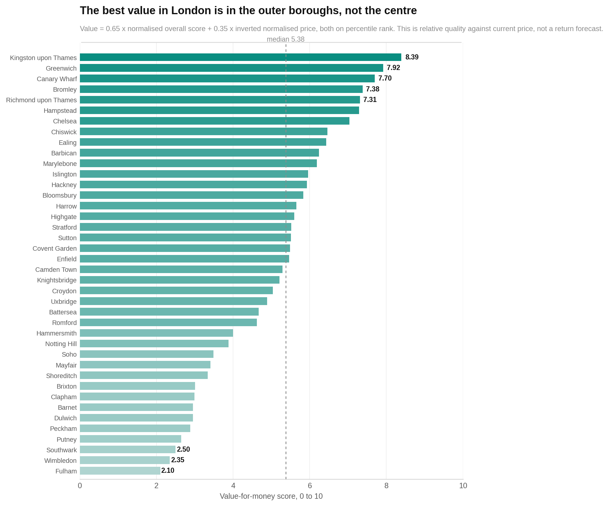
The value leaders sit mostly beyond central London
Kingston upon Thames leads the value score. It combines an overall score of 8.22 with a sale price of £6,800 per square metre. Greenwich follows with a score of 8.07 and a price of £6,000. Canary Wharf and Bromley complete the top four.
The next chart ranks areas using 65% measured quality and 35% lower sale price. Longer bars mean more quality for the reported price. Look for outer areas near the top and premium central districts farther down. This is a present-day comparison, not a prediction of future returns.
As with the two preceding figures, the supplied label says 63 areas while the stated analysis contains 40.
Value does not mean cheapest
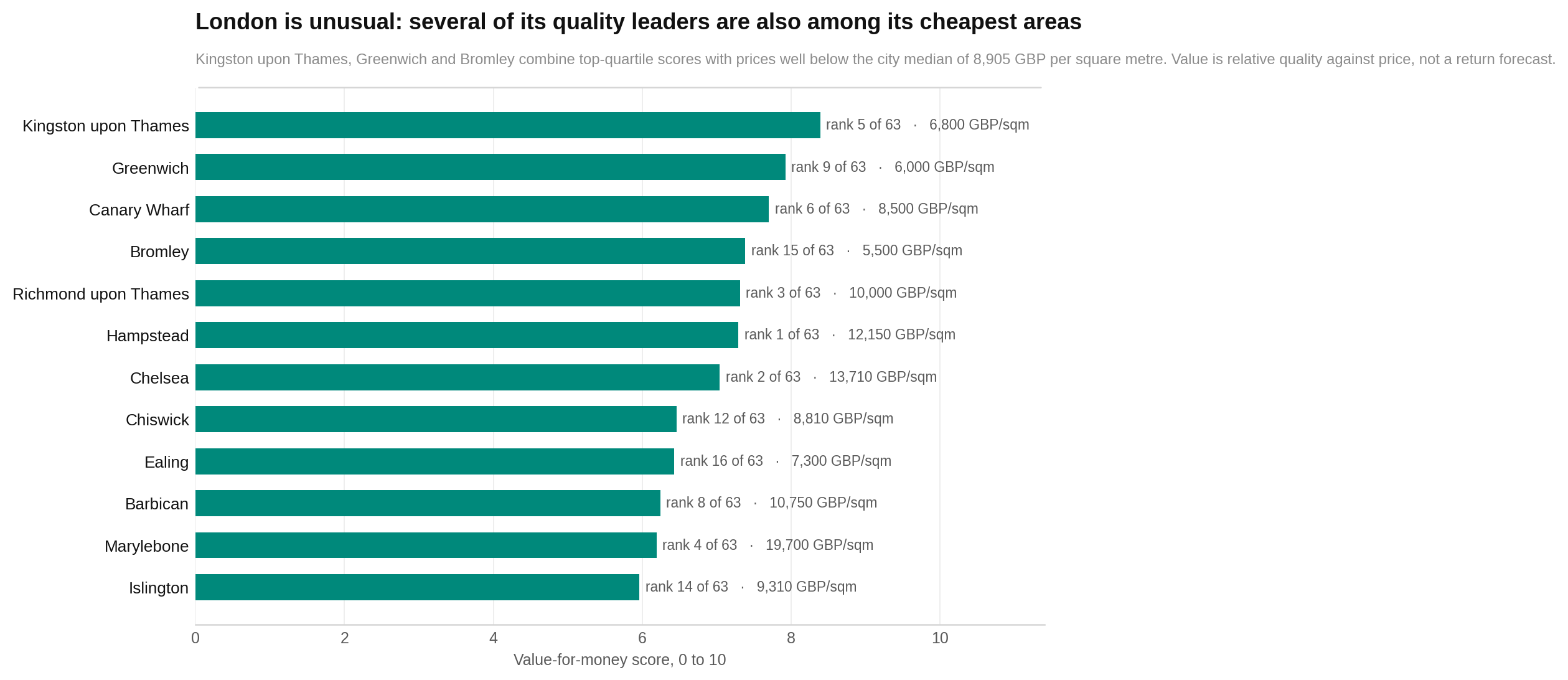
The strongest value areas are not simply the places with the lowest prices. They combine a respectable or high quality score with a lower position in the price table. Croydon is the cheapest area, for example, but ranks 23rd on the value score rather than first.
This chart puts the twelve leading value areas beside their quality rank and sale price. Read each row across: the value result comes first, then the quality position and the price behind it. Look for areas that remain high on quality while sitting well below central-London prices.
Seven areas land in London’s practical sweet spot
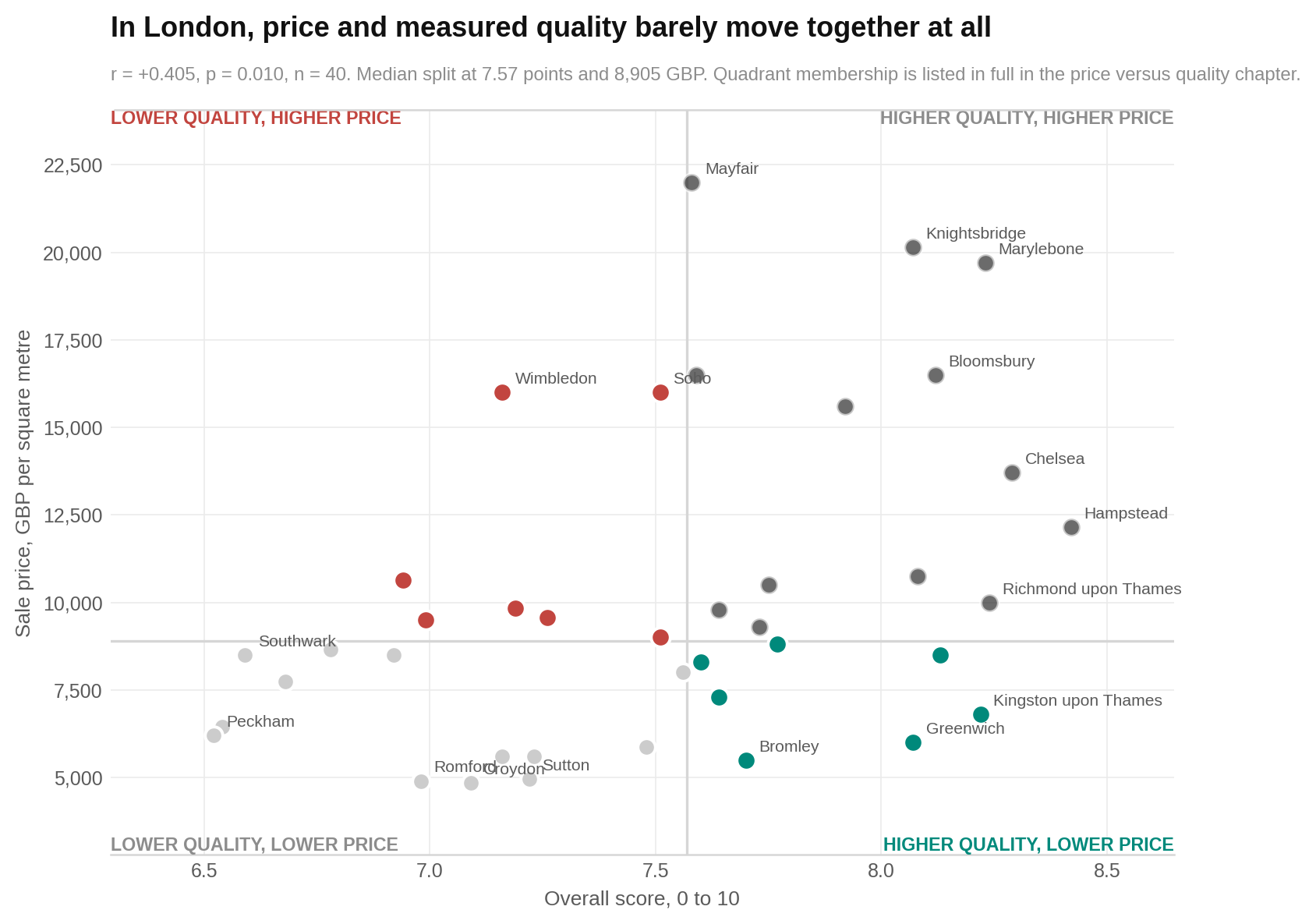
Bromley, Canary Wharf, Chiswick, Ealing, Greenwich, Hackney and Kingston upon Thames all score at or above the city median while costing below the median. Together they average 7.88 and £7,315 per square metre.
This chart places every area by overall score and sale price. Each dot is a neighbourhood. Higher means a better overall score; farther right means a higher reported price. The dividing lines are the city medians. Look in the higher-quality, lower-price section for the seven potential value opportunities.
The great London trade-off: a garden or a busy high street
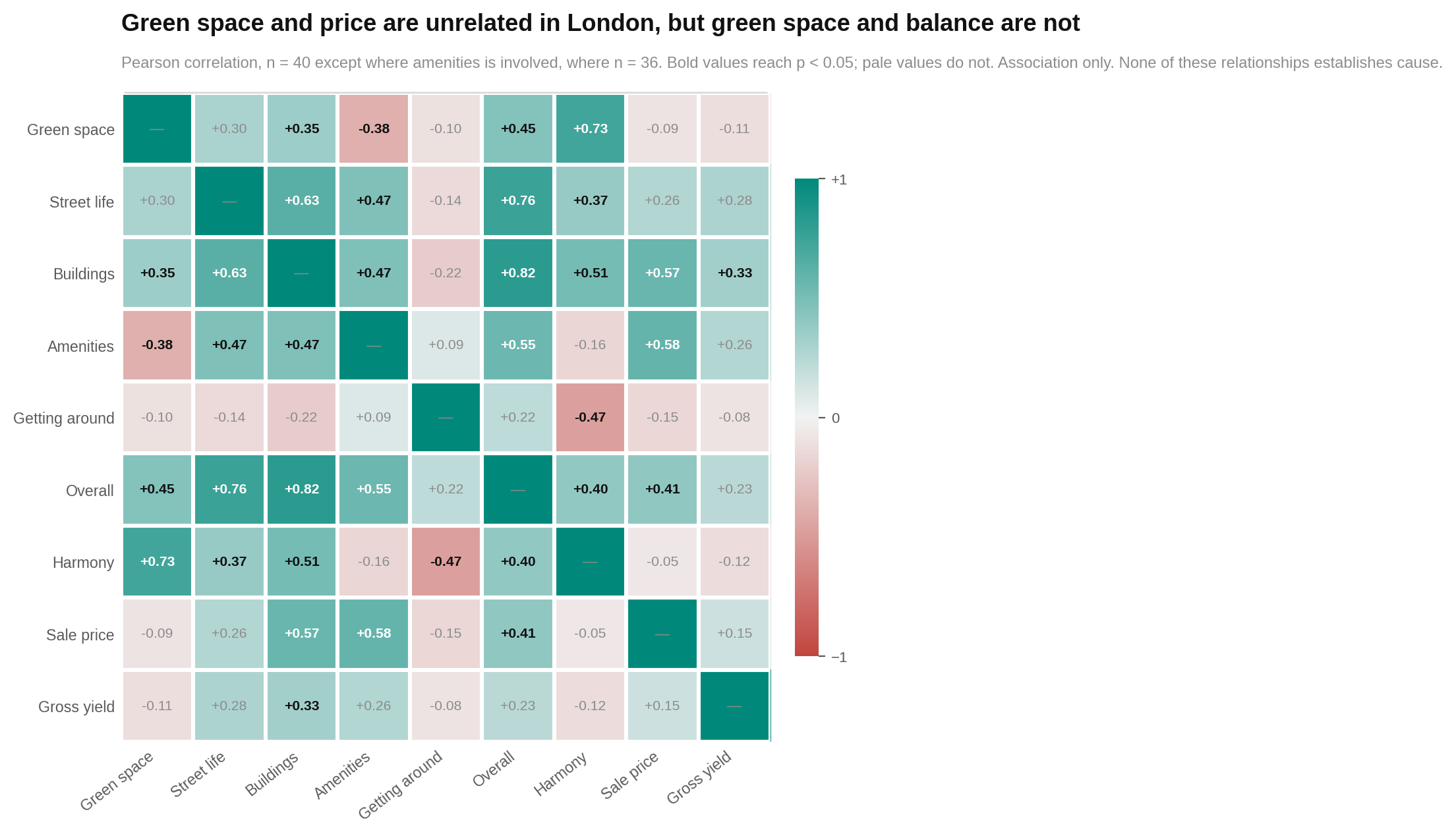
If you want more green space, expect fewer food choices and less street activity nearby. This is the sharpest lifestyle trade-off in the data. Green space moves strongly against food services, street vibrancy and entertainment.
The chart is a relationship map. Every row and column is a measure. Darker or stronger colour means two measures move closely together; the opposite colour means one tends to rise as the other falls. Read where a row and column meet. Look especially at green space against food, entertainment and street vibrancy, and at the overlap between food and busy streets.
Some ranks are firmer than others
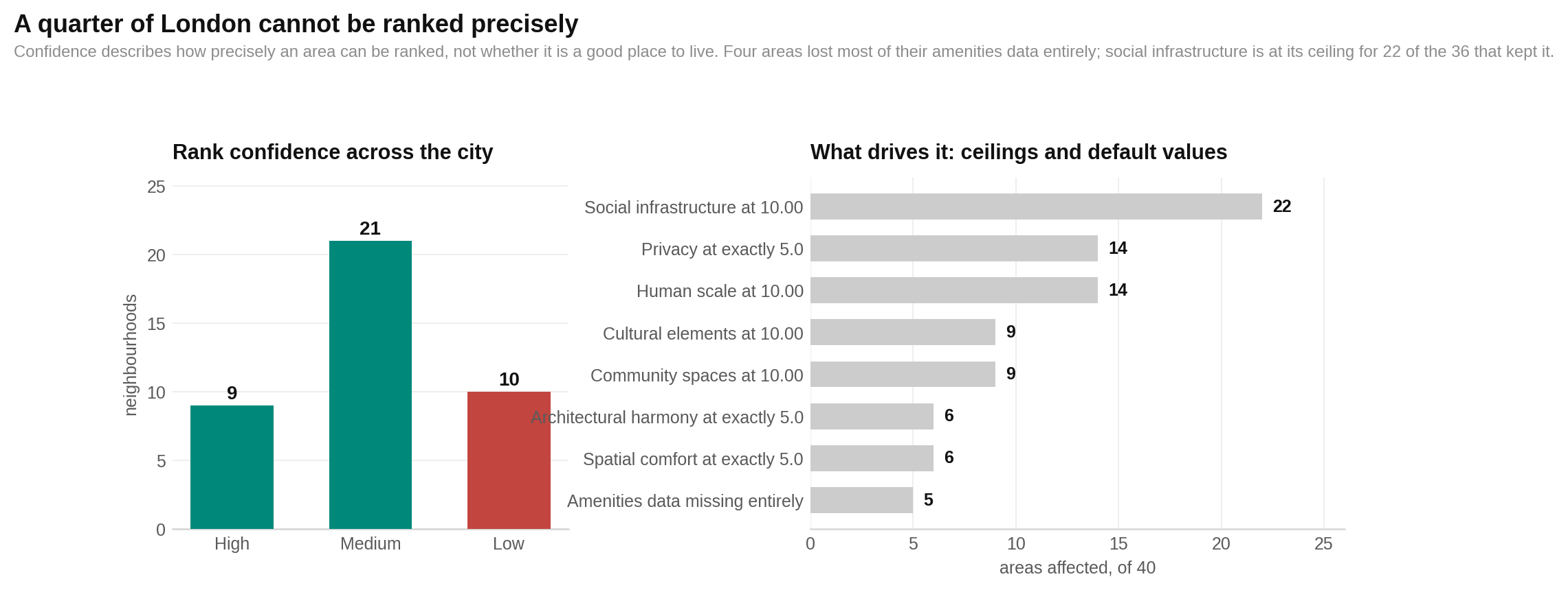
A leaderboard looks precise even when the underlying measurements are not. Some sub-scores repeatedly hit the maximum of 10. Others recur at default-looking values such as exactly 5. Those ties make it harder to separate nearby areas.
This chart combines rank-confidence labels with counts of ceiling and default values. Read the confidence label as a guide to placement, not liveability. More repeated ceiling or default values mean less confidence in an exact rank. Look for low-confidence areas such as Canary Wharf, Bloomsbury, Barbican, Covent Garden, Mayfair, Soho, Wimbledon, Fulham, Putney and Brixton.
Who each area suits best
These are shortlists, not universal winners. Each recommendation below comes directly from the report’s category scores, audience rankings, prices or value findings.
| If you are… | Look at… | Why |
|---|---|---|
| Raising a family | Richmond upon Thames, Kingston upon Thames, Hampstead, Greenwich, Bromley, Highgate | These lead the report’s family profile, which uses safety, greenery, environmental quality, space, social infrastructure, maintenance and transit. Kingston upon Thames, Greenwich and Bromley offer the lower reported prices in this group. |
| Looking for quiet residential living | Highgate, Hampstead, Richmond upon Thames, Chiswick, Dulwich, Enfield | They lead on the report’s mix of privacy, lower street activity, greenery, environmental quality and safety. The common compromise is thinner amenities. |
| Chasing food, culture and nightlife | Covent Garden, Soho, Marylebone, Islington, Barbican, Camden Town | These are the six highest nightlife fits. Most are expensive, and green space is the common weakness. |
| A young professional | Croydon, Camden Town, Covent Garden, Barbican, Hackney, Richmond upon Thames | They lead the report’s young-professional mix of street activity, food, entertainment, culture, walkability and transit. Their prices and building scores vary widely, so check the trade-off area by area. |
| A student or first mover | Croydon, Bromley, Ealing, Hackney, Kingston upon Thames, Romford | The student profile puts affordability first, followed by transport, food and culture. Buildings and upkeep is the most common weakness. |
| A renter watching monthly costs | Kingston upon Thames, Ealing, Croydon, Stratford, Richmond upon Thames, Bromley | These lead a profile weighted toward lower rent, transport, food, social infrastructure and maintenance. |
| Living without a car | Hackney, Croydon, Richmond upon Thames, Ealing, Kingston upon Thames, Harrow | They lead on street-network access, transit and daily services. The report found transport fairly strong across London, so examine the specific route you need rather than relying on the overall rank. |
| A buyer seeking measured value | Kingston upon Thames, Greenwich, Canary Wharf, Bromley | These are the top four value scores. Canary Wharf’s green-space data is partial, so its position needs extra caution. |
| Buying at the premium end | Marylebone, Bloomsbury, Knightsbridge, Covent Garden | Among the most expensive fifth of the sample, these have the strongest measured quality or value support. Green space is the usual compromise. |
The dataset does not measure schools, healthcare, job access, household demographics, council tax or journeys to a specific employer. It cannot honestly name a best area for those needs.
The bottom line
London does not offer a simple ladder from bad neighbourhoods to good ones in this sample. All 40 areas sit between 6.52 and 8.42. A difference of a few ranking places is rarely the useful part.
The real choice is between lifestyles. Greener areas tend to be quieter and less rich in restaurants and entertainment. Central amenity-heavy districts often trade away greenery and charge more. Buildings and upkeep create the largest quality gaps, while transport is good enough across much of the sample that it does little to sort the leaderboard.
For value, begin with Kingston upon Thames, Greenwich, Canary Wharf and Bromley. For balance, look at Chiswick. For greenery and calm, Highgate and Hampstead lead. For nightlife, start with Covent Garden and Soho and accept that the park may not be outside your door.
Use the overall score to make a shortlist. Use the five pillars, price and data-confidence flags to make the decision.
The fine print
Scope and timing
The report states that 40 London neighbourhoods were analysed using 19 sub-scores, five categories, two price indicators and four derived measures. Scores are dated 24 July 2026. The report was generated 29 July 2026. Price observations run from January 2025 to July 2026.
Several supplied figure labels and parts of the methods text refer to 63 areas, while the title page, leaderboard, profiles and principal analysis refer to 40. The methods text also says there are no missing values, but other chapters document missing data in five areas. These are unresolved internal inconsistencies. This article uses the clearly enumerated 40-area leaderboard and preserves the figure warnings rather than silently reconciling them.
Score distributions
- Overall score: mean 7.50, median 7.57, sample standard deviation 0.53, minimum 6.52 and maximum 8.42, n=40.
- Score bands: 10 very strong, 21 strong and nine above average. None is below the report’s above-average band.
- Green space and environment: mean 6.70, median 6.76, standard deviation 0.80, range 5.33–8.68.
- Street life and human scale: mean 7.60, median 7.66, standard deviation 0.64, range 5.96–8.61.
- Buildings and upkeep: mean 6.88, median 6.82, standard deviation 1.35, range 3.65–9.35.
- Amenities and community: mean 8.25, median 8.30, standard deviation 0.76, reported range 6.84–9.55. Amenities relationships use n=36 because four areas lost most of this data.
- Getting around: mean 8.21, median 8.48, standard deviation reported as 0.96 in the summary and 0.97 in the category chapter, range 5.85–9.60.
- Harmony: mean 8.12, minimum 6.59 and maximum 9.37.
Main statistical relationships
These are associations, not proof that one feature causes another. Pearson correlations are shown as r, with p indicating how compatible the result is with no relationship in this sample and n giving the number of areas.
| Relationship | r | p | n | Outlier check |
|---|---|---|---|---|
| Buildings and upkeep with overall score | +0.817 | <0.001 | 40 | Survives |
| Street life and human scale with overall score | +0.758 | <0.001 | 40 | Survives |
| Green space and environment with harmony | +0.725 | <0.001 | 40 | Survives |
| Street life with buildings and upkeep | +0.631 | <0.001 | 40 | Survives |
| Amenities and community with sale price | +0.584 | <0.001 | 36 | Survives |
| Buildings and upkeep with sale price | +0.568 | <0.001 | 40 | Survives |
| Amenities and community with overall score | +0.551 | <0.001 | 36 | Survives |
| Buildings and upkeep with harmony | +0.512 | <0.001 | 40 | Survives |
| Green space and environment with overall score | +0.450 | 0.004 | 40 | Survives |
| Overall score with sale price | +0.405 | 0.009 | 40 | Not reported as failing |
| Harmony with overall score | +0.398 | 0.011 | 40 | Fails |
| Rent with overall score | +0.353 | 0.025 | 40 | Not stated |
Harmony with overall score has Spearman rho=+0.376. After removing the two largest outliers, Pearson r falls to +0.267 with p=0.105. The report therefore treats this as a direction rather than a firm conclusion.
Results where evidence was not found
- Getting around with overall score: r=+0.218, p=0.176, n=40. On the 36 areas with complete transport data, r=+0.292 and p=0.084. The sample found no evidence that transport predicts the overall score, but it cannot rule out a moderate relationship.
- Getting around with price: r=-0.150, p=0.355, n=40. This is not evidence that transport has no value.
- Green space and environment with price: r=-0.085, p=0.601, n=40. The category-level result does not show a price relationship, although the green-space sub-score alone is negatively associated with price.
- Street life with price: r=+0.264, p=0.100, n=40. The sample does not establish a relationship.
- Gross yield with overall score: r=+0.227, p=0.158, n=40. The sample does not establish a relationship.
Street activity, greenery and overlapping measures
- Street vibrancy with food services: r=+0.883, p<0.001.
- Street vibrancy with entertainment: r=+0.880, p<0.001.
- Green space with food services: r=-0.812, p<0.001.
- Green space with street vibrancy: r=-0.803, p<0.001.
- Green space with entertainment: r=-0.788, p<0.001.
- Street vibrancy with cultural elements: r=+0.779, p<0.001.
Street activity appears in more than one pillar through closely related measures. That means a lively street may influence the overall average more than once. The report publishes this as an open weighting flag and does not correct it.
Price relationships
Sale price has a median of £8,905 per square metre, a mean of £10,105 and a range of £4,850–£22,000. The quartiles are £6,712, £8,905 and £11,100. Mayfair is the only price more than 2.5 standard deviations above the mean. Rent has a median of £31 per square metre per month and a range of £16–£145. Median implied gross yield is 4.06%, with a range of 2.62%–7.91%.
| Sub-score with sale price | r | p | n where stated |
|---|---|---|---|
| Cultural elements | +0.731 | <0.001 | 36 |
| Building quality | +0.604 | <0.001 | 40 |
| Street vibrancy | +0.550 | <0.001 | Not stated in table |
| Maintenance | +0.513 | <0.001 | 40 |
| Architectural harmony | +0.507 | <0.001 | Not stated in table |
| Green space | -0.439 | 0.005 | 39 |
| Safety and security | +0.347 | 0.028 | Not stated in table |
| Entertainment | +0.331 | 0.049 | Not stated in table |
| Climate comfort | +0.323 | 0.042 | Not stated in table |
| Food services | +0.323 | 0.054 | Not stated in table |
Rent and sale price track closely at r=+0.825, p<0.001, n=40. Price vintage with sale price gives r=-0.146, p=0.369, n=40. That does not show vintage driving the results, but the eighteen-month spread remains a limitation because no price index was supplied.
Robustness checks
Headline results were re-run on 35 areas described as having complete coverage. Price with overall score moves from r=0.405 to 0.467. Harmony with overall moves from 0.398 to 0.357. Green space and environment with price moves from -0.085 to -0.077. The report says no conclusion changes. The value ranking was also recomputed using min-max scaling instead of percentile ranks; the two orders agree at Spearman rho=0.973.
Missing data, ceilings and rank confidence
Brixton, Fulham, Mayfair and Putney lost five of six amenities sub-scores, street vibrancy and the street-network half of getting around in one collection failure. Their overall scores use four categories rather than five, and their ranks are indicative. Canary Wharf separately lacks its green-space sub-score. Amenities statistics therefore use 36 areas, and green-space sub-score relationships use 39 where noted.
Social infrastructure reaches 10.00 in 22 of the 36 areas with amenities data. Human scale reaches 10.00 in 14 of 40. Privacy is exactly 5.0 in 14 areas. Several building measures take only six or seven distinct values. These ties weaken exact ranking precision. Areas should be treated as sitting in broad bands rather than as definitively separated by a few places.
Price source and omitted needs
Sale prices and rents were supplied with the export rather than calculated by HoodEx. The report gives no source, methodology, transaction count or distinction between asking and completed-sale prices. Treat small price differences as noise. The unusually high Mayfair rent of £145 per square metre per month drives its reported 7.91% gross yield and deserves particular caution.
The dataset does not measure education, healthcare, employment, demographics, council tax, school catchments, social ties or commute time to a specific destination. Gross yield ignores vacancy, costs, taxation and condition. None of the price or value results is investment advice.
Methodology · All HoodEx Research · Explore London2 neighborhoods