Berlin’s Best Neighbourhoods Are Closer Than the Rankings Suggest
Transport is strong almost everywhere, while amenities, quiet and distance do the real work of separating one area from another.
A tram rattles past a busy corner in Prenzlauer Berg. Tables spill onto the pavement. Across the region, the streets of Wannsee and Kleinmachnow tell another story. There are trees, large homes and far fewer places to stop for dinner.
Both versions of Berlin can be expensive. That is the puzzle at the heart of this report.
HoodEx measured 50 areas. Thirty-nine are inside Berlin and 11 are in Brandenburg. The surprising result is not that some places score better than others. It is how little separates most of them—and how strongly a small group of quiet, expensive areas bends the property story.
The short version
- Most areas perform well. Forty-three of the 50 sit in the strong or very strong score bands. None scores below 5.87 out of 10.
- Transport will rarely settle your shortlist. Getting around averages 8.98. It is excellent in so many places that other priorities become more useful.
- Amenities create the clearest divide. Prenzlauer Berg leads this pillar at 9.51. Schönefeld sits at 3.92.
- Berlin usually charges for restaurants and services—but eight quiet areas hide that pattern. Those places are greener, more expensive and have almost no recorded entertainment.
- Brandenburg is cheaper, but the main sacrifice is convenience. The measured gap is €941 per square metre, alongside lower amenities and transport scores.
- Value sits mostly outside the inner ring. Reinickendorf, Potsdam, Tegel and Rudow lead the value measure.
How HoodEx scores a neighbourhood
The method starts with an idea from the Greek planner Constantinos Doxiadis. He argued that a successful place must serve five things at once: nature, people, social life, buildings and movement.
HoodEx turns those ideas into five pillars. They are green space and environment, street life and human scale, buildings and upkeep, amenities and community, and getting around. Each receives a score from 0 to 10.
The overall score is the simple average of the pillars with enough data. All 50 areas in this report had enough information for all five, so every overall score is an average of five pillars. A score is absolute rather than graded against Berlin. In principle, 7.0 means the same thing in every HoodEx city report.
| Pillar | What it covers | Berlin-region average |
|---|---|---|
| Green space and environment | Parks, natural features, air and noise | 7.00 |
| Street life and human scale | Comfort, privacy, climate and street activity | 7.19 |
| Buildings and upkeep | Maintenance, building quality and architectural coherence | 6.97 |
| Amenities and community | Food, entertainment, culture, services and safety | 7.53 |
| Getting around | Street networks and public transport | 8.98 |
Two extra measures appear later. Harmony describes how even the five pillars are. Value combines 65% measured quality with 35% lower sale price. Neither is a promise about happiness or future investment returns.
A good region with a narrow gap from top to bottom
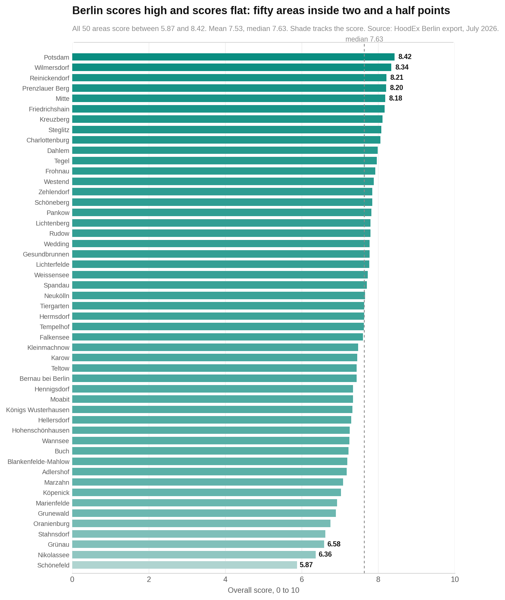
The first practical lesson is simple: a low rank does not automatically mean a poor place. Potsdam leads at 8.42. Schönefeld is last at 5.87. The whole list fits inside 2.55 points.
The chart shows every area’s overall score. Each bar is one area, and a longer bar means a higher score. Look at how compressed the bars are rather than obsessing over a difference of a few places. Rankings can shift when scores are close.
Transport is the shared strength; amenities are the dividing line
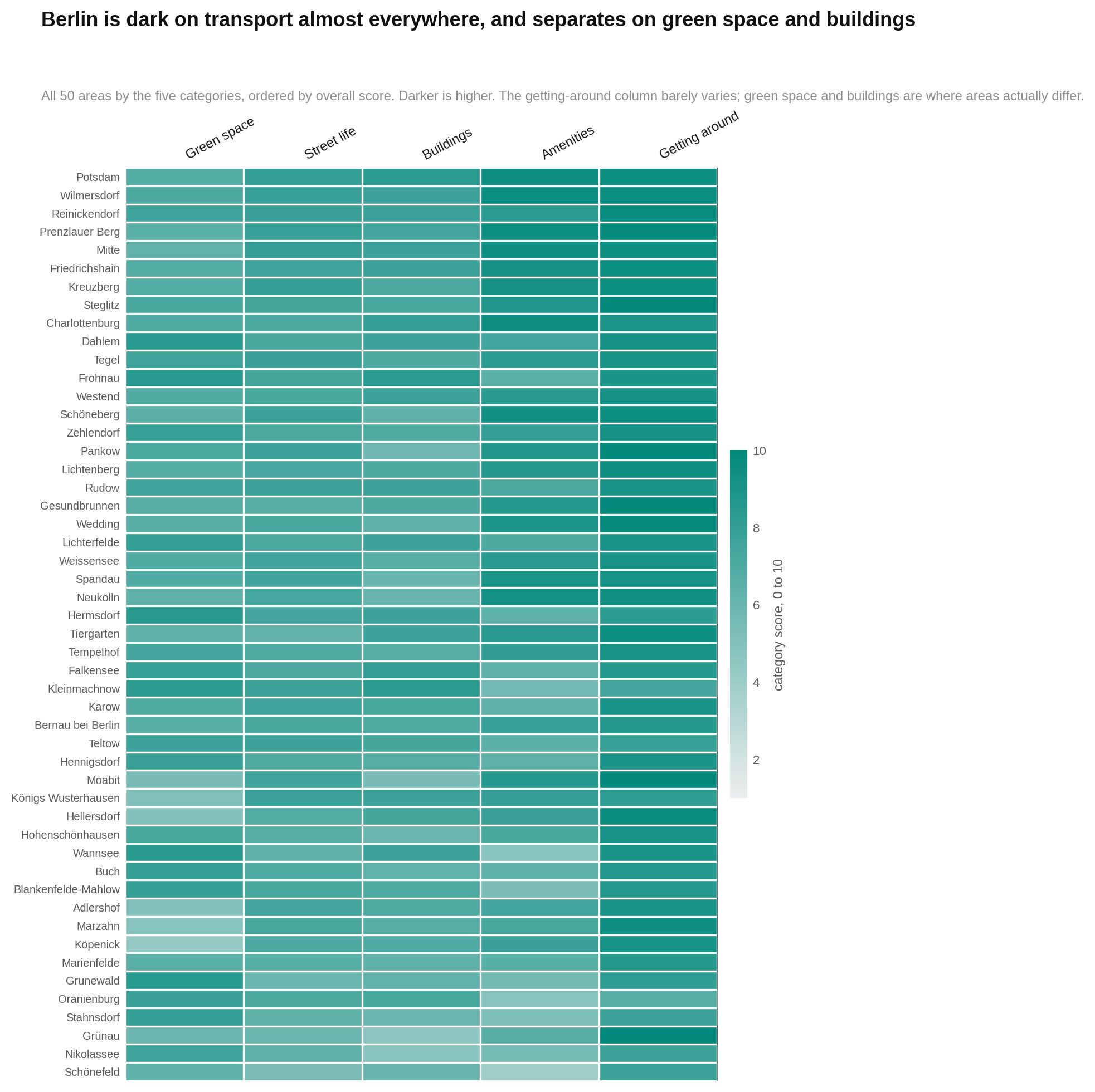
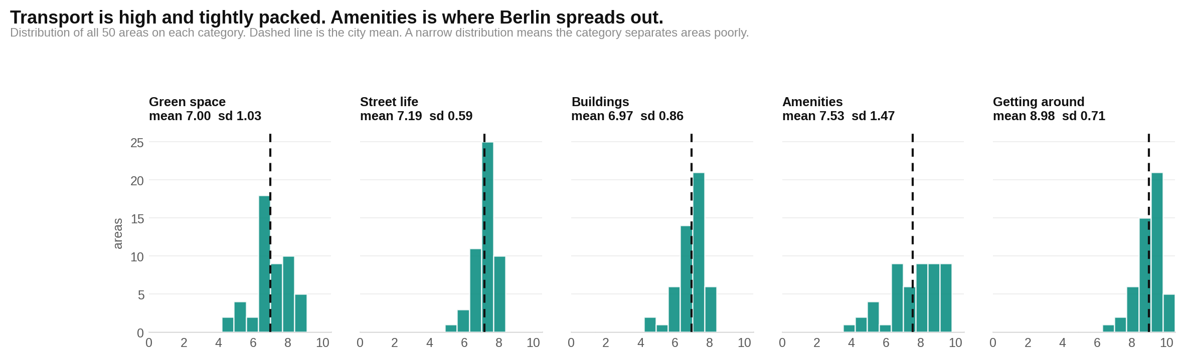
If you are choosing between Berlin areas, start with services and street life rather than assuming transport will reveal the winner. Getting around averages 8.98, while amenities range from 3.92 to 9.51.
The next two charts show the same five pillars from different angles. In the first, every row is an area and darker cells mean higher scores. Read across a row to see its trade-offs. Then look down each column to see which pillars vary most.
The following distribution chart gathers each pillar’s 50 scores together. A tight cluster means areas are hard to distinguish on that subject. A wide spread means the pillar is useful for choosing. Notice the tight transport cluster and the much wider amenities spread.
There is no single winning neighbourhood shape
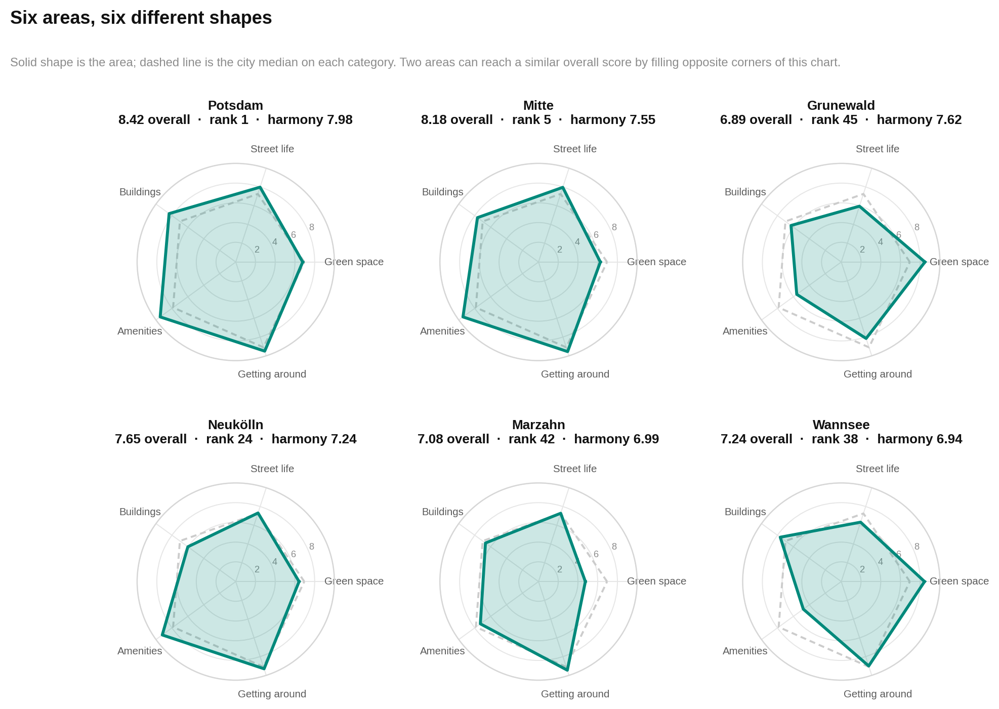
Potsdam, Wilmersdorf and Reinickendorf reach the top in different ways. The same is true further down the table. One area may offer restaurants and transport. Another may trade those things for trees, privacy or better-kept buildings.
This chart compares six notable areas with the regional middle score in every pillar. Each spoke is one pillar. Farther from the centre means a higher score. The solid shape is the area; the dashed outline is the regional median. Look for the dents and bulges, because those matter more than the final rank.
Crossing into Brandenburg saves money, not trees or buildings
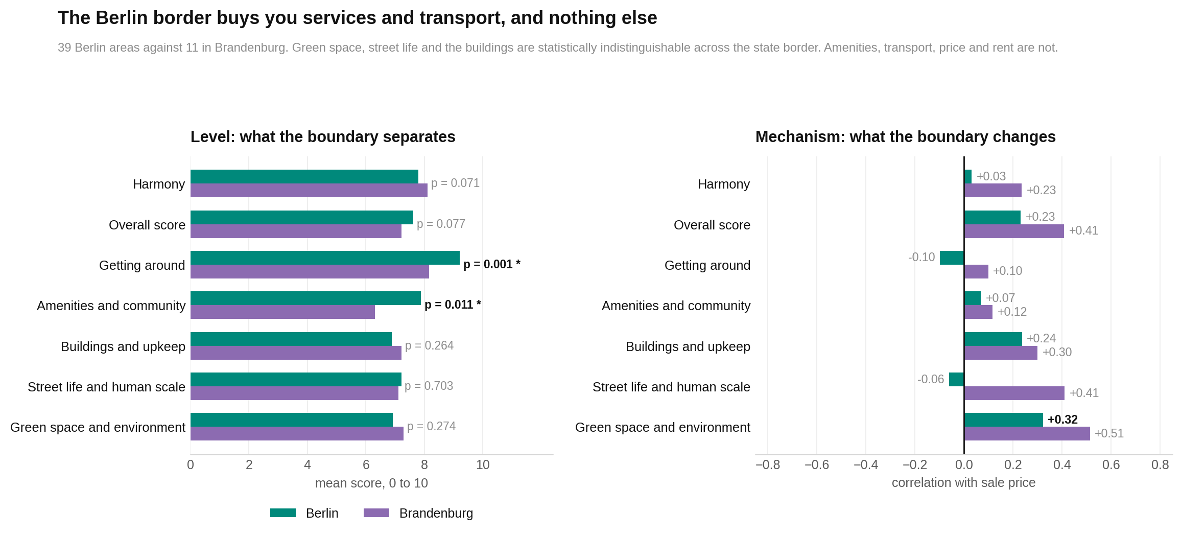
Moving beyond the Berlin state border mainly costs you services and transport. It does not produce a clear measured change in green space, street life or buildings.
The chart compares the 39 Berlin areas with the 11 Brandenburg areas. Bars or markers show each side’s average, depending on the measure. A larger gap means the border separates the groups more clearly. Focus on amenities, transport and price: those are the gaps supported by the report’s tests.
Brandenburg averages 1.56 points lower for amenities and 1.05 lower for getting around. The average sale-price difference is €941 per square metre. Rent is €3.51 per square metre per month lower. Venue counts average about 25 outside Berlin and 122 inside it.
A balanced score is not the same as a better place
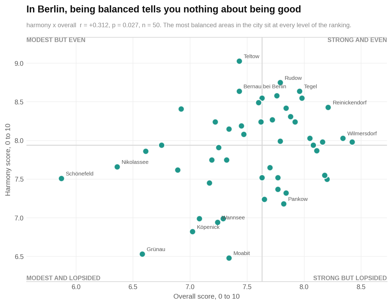
Do not use harmony as a ready-made shortlist. It tells you whether an area’s five pillars sit close together. It does not tell you whether those pillars are high.
The first chart places overall quality against harmony. Each dot is one area. Farther right means a better overall score; higher means a more even profile. If balance reliably meant quality, the dots would form a clear upward line. They do not form a useful decision-making pattern.
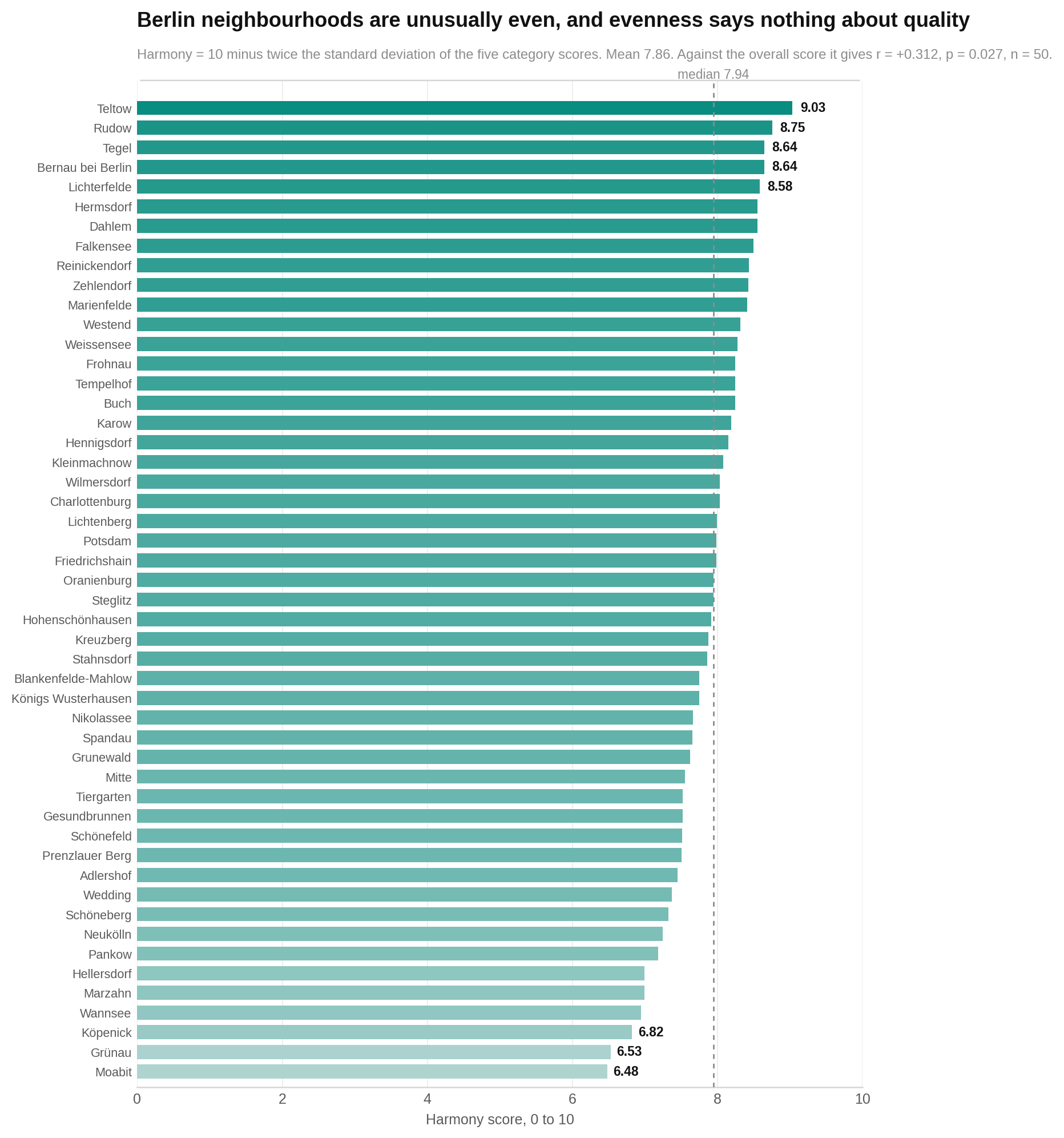
The second chart ranks all 50 harmony scores. Longer bars mean a more even set of pillars. Teltow leads at 9.03 but ranks 31st on overall quality. Moabit is least even at 6.48. Notice that high harmony appears at many different quality levels.
Berlin’s price ladder is unusually short
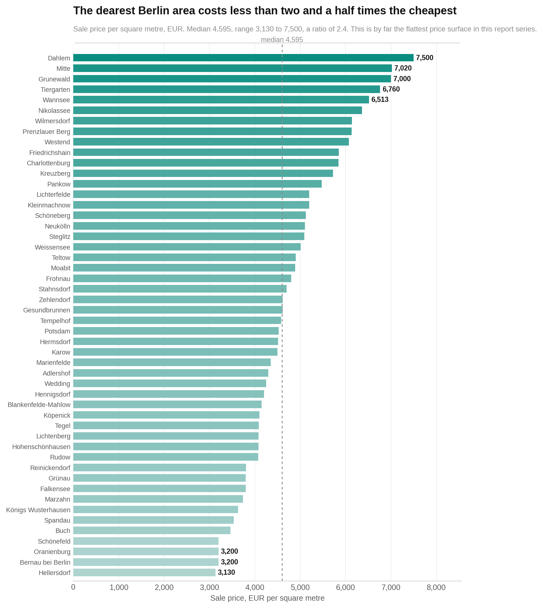
The cheapest and most expensive measured areas are separated by a factor of 2.4. Hellersdorf is €3,130 per square metre. Dahlem is €7,500. The regional median is €4,595.
The chart orders all 50 sale prices. Each bar is an area and a longer bar means a higher price per square metre. Look for the relatively compact middle of the list and the expensive western lake and forest districts near the top.
Rents range from €10.50 to €22.00 per square metre per month. The implied gross rental yield ranges from 2.88% in Dahlem to 5.74% in Schönefeld. These are descriptions of the supplied prices and rents, not forecasts.
What improves a score is not always what raises the price
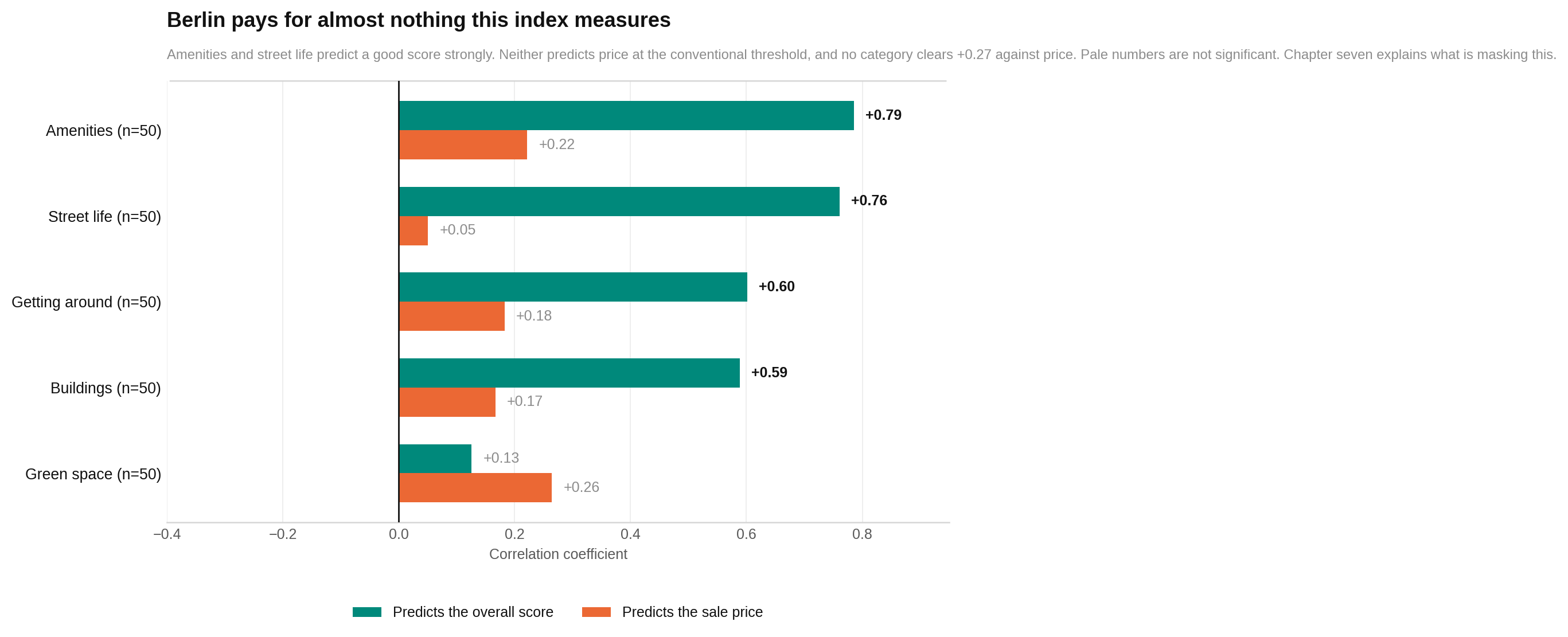
Amenities and street life do the most to distinguish high overall scores. But across all 50 areas, no whole pillar has a clear standalone relationship with sale price.
This chart compares every pillar twice. One set of marks shows how closely it moves with the overall score. The other shows how closely it moves with sale price. Marks farther to the positive side indicate that two measures tend to rise together. Look for the strong quality links for amenities and street life, followed by the much weaker price links.
This does not prove that amenities are free. Eight unusual, expensive and quiet areas are masking that relationship. We return to them shortly.
Compare equally distant areas and safety carries a premium
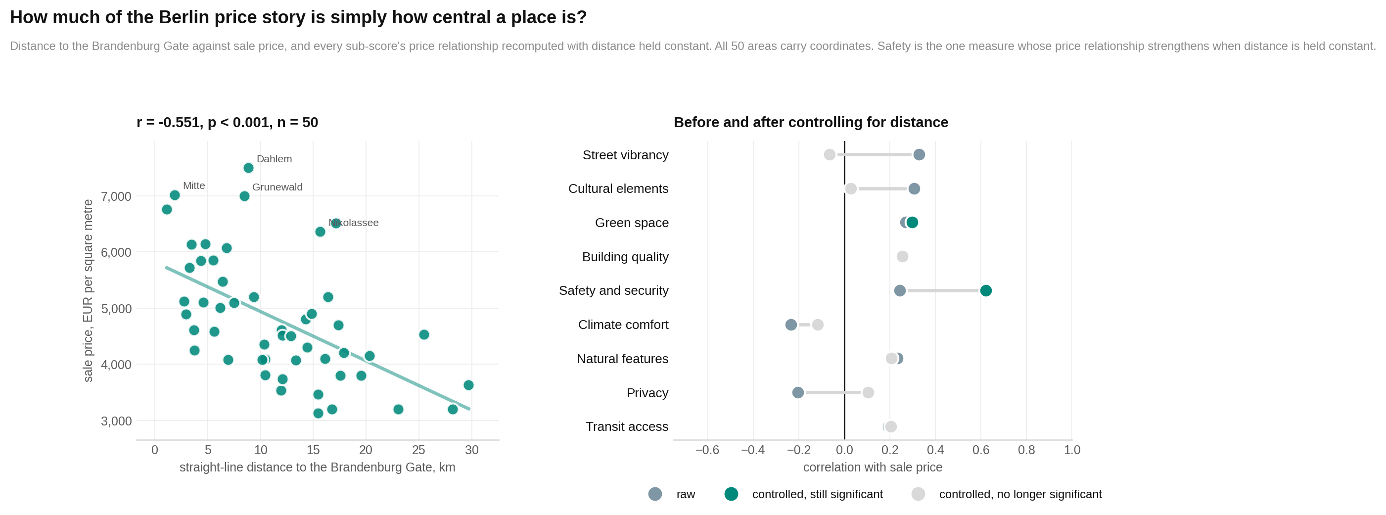
Central areas are generally more expensive and score better on this framework. Distance from the Brandenburg Gate therefore clouds the view of what buyers pay for.
The chart’s first panel places distance against price. Each dot is an area. Farther right means farther from the Brandenburg Gate; higher means more expensive. The downward pattern shows prices falling with distance. The other panel recalculates each score-price relationship after holding that distance steady. Positive marks mean higher scores still go with higher prices among similarly distant areas.
The result to notice is safety. Its raw link with price is weak and uncertain. Once distance is held steady, it becomes the strongest controlled relationship in the report. Green space also retains a smaller price link. Street vibrancy and culture no longer do, suggesting that their apparent premiums mostly reflect central location.
Eight quiet areas turn the usual price story upside down
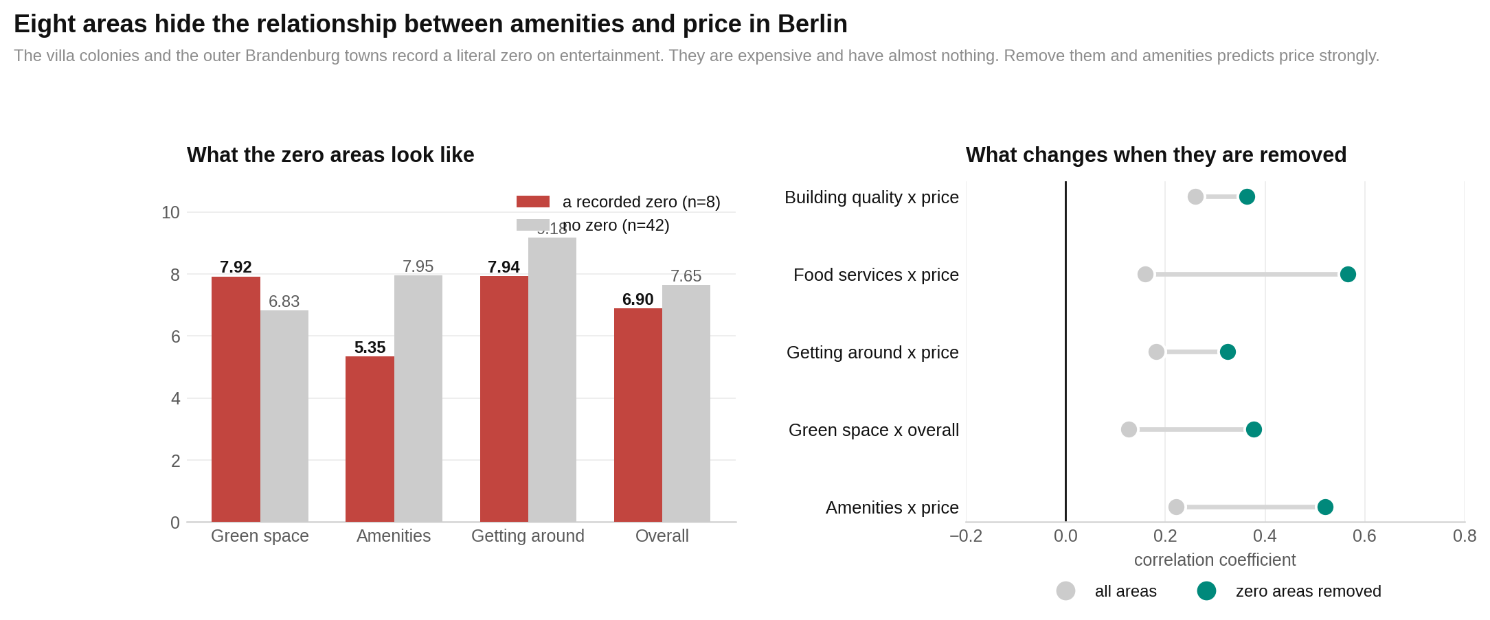
For ordinary Berlin neighbourhoods, more amenities generally come with higher prices. Eight expensive, green and deliberately quiet places hide that pattern when all 50 areas are mixed together.
The eight are Dahlem, Grunewald, Kleinmachnow, Nikolassee, Oranienburg, Schönefeld, Stahnsdorf and Wannsee. Each has a recorded entertainment score of zero.
The chart compares these eight with the other 42 and shows how the price relationships change when they are set aside. Group bars compare averages. The relationship markers show whether prices tend to rise with amenities. Look for the unusual combination: the eight are greener and €787 per square metre more expensive on average, yet have far fewer amenities and venues.
They average 8.1 restaurants, cafes and bars, compared with 118.2 elsewhere. The report therefore treats the zeros as genuine measured scarcity, not simply blank data.
The strongest value cases sit beyond the inner ring
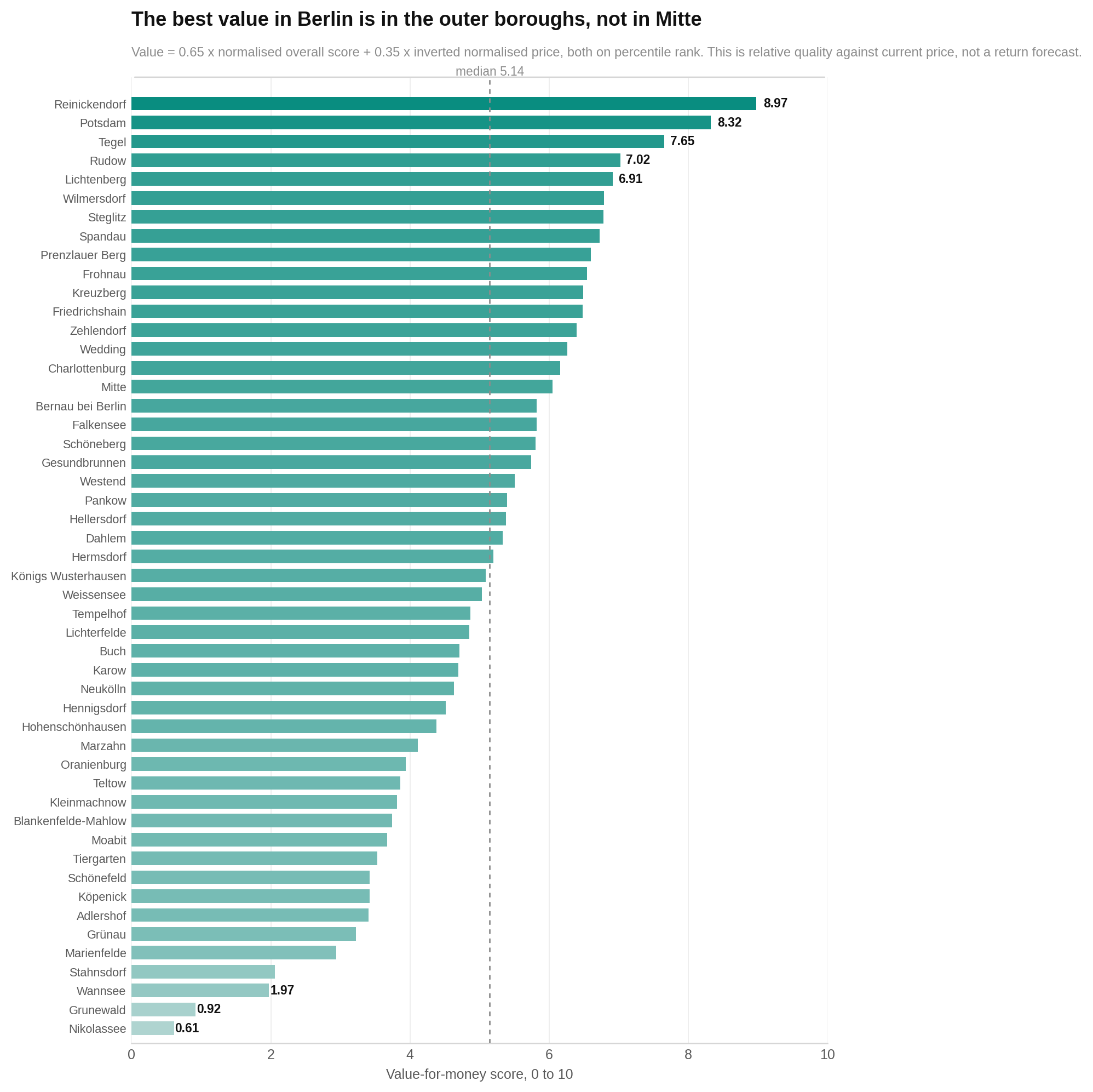
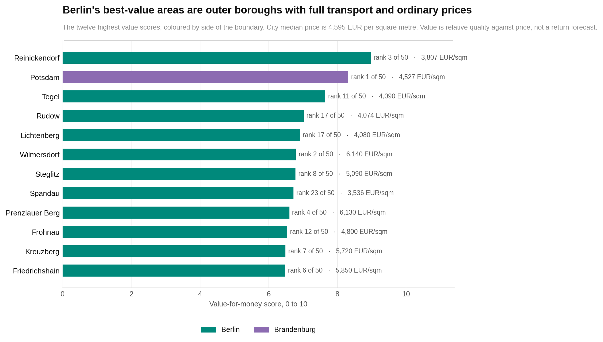
If you want measured quality without top-tier prices, look first at Reinickendorf, Potsdam, Tegel and Rudow. All four are outside the inner ring and all score above 8.00 for getting around.
The first chart ranks every value score. Longer bars mean more measured quality for the current sale price under HoodEx’s 65% quality and 35% price formula. It is not a forecast of future growth.
The next chart zooms in on the top 12 and uses colour to distinguish Berlin from Brandenburg. Read the height or length as value and the colour only as which side of the state border the area occupies. Notice that good value appears on both sides.
Reinickendorf leads at 8.97, with an overall score of 8.21 and a price of €3,807 per square metre. Potsdam follows at 8.32. A caution: Reinickendorf and Tegel share coordinates and points-of-interest data, so the top of the list is less varied than it appears.
Eight areas land in the high-quality, lower-price corner
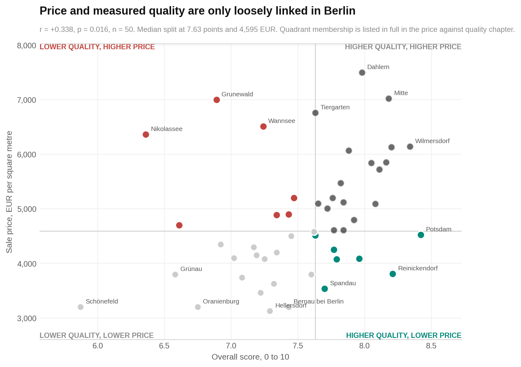
The clearest shortlisting group contains Hermsdorf, Lichtenberg, Potsdam, Reinickendorf, Rudow, Spandau, Tegel and Wedding. Each scores at or above the overall median while costing less than the price median.
The chart places price against overall score. Each dot is an area. Higher means a better score; farther right means a higher sale price. The horizontal and vertical lines mark the two medians. The upper-left corner is the value-hunter’s starting point. The lower-right contains areas whose prices run ahead of what this index measures.
Do not treat the lines as cliffs. An area just to one side sits in the same broad band as one just across it. The report also does not measure schools, healthcare, lake access, commute times or personal ties, all of which may explain a premium.
Who each area suits best
No neighbourhood wins for everyone. These matches use only the report’s scores, prices and profile findings.
| If you are… | Look at… | Why |
|---|---|---|
| A family with kids | Frohnau, Kleinmachnow, Karow, Zehlendorf, Hermsdorf | These lead the report’s family profile, which weights safety, green space, clean air, room, services, upkeep and transit. |
| A young professional | Wilmersdorf, Mitte, Prenzlauer Berg, Steglitz, Potsdam, Wedding | They lead the published mix of street life, food, culture, entertainment and transport. |
| Looking for quiet residential living | Karow, Kleinmachnow, Stahnsdorf, Blankenfelde-Mahlow, Wannsee, Hermsdorf | They score highly for privacy, calm streets, green surroundings and environmental quality. |
| A nightlife and restaurant lover | Wilmersdorf, Mitte, Wedding, Neukölln, Schöneberg, Prenzlauer Berg | They lead the entertainment, food and street-activity profile. |
| Trying to live without a car | Steglitz, Moabit, Wilmersdorf, Gesundbrunnen, Prenzlauer Berg, Pankow | They combine strong street networks, transit and access to daily services. |
| A student | Wedding, Hellersdorf, Steglitz, Reinickendorf, Gesundbrunnen | The student profile puts affordability first, then transit, food, entertainment and culture. |
| A value-focused buyer | Reinickendorf, Potsdam, Tegel, Rudow, Lichtenberg, Spandau | These combine comparatively high measured quality with lower or moderate sale prices. Reinickendorf and Tegel overlap in the data. |
| Renting on a tighter budget | Karow, Königs Wusterhausen, Rudow, Hellersdorf, Blankenfelde-Mahlow, Falkensee | They lead a profile built around lower rent, transit, daily services and maintenance. |
The report does not contain school performance, healthcare access or household-size data. Its family matches should therefore be treated as starting points, not full family recommendations. It also does not provide evidence for future price growth, so no area can honestly be labelled an investment winner.
The bottom line
Berlin is less a contest between good and bad areas than a choice between different kinds of good. Most measured places score strongly, and transport is a shared advantage.
The real choice is between activity and calm. Areas such as Prenzlauer Berg, Wilmersdorf and Mitte offer dense amenities and street life at higher prices. Places such as Karow, Kleinmachnow, Wannsee and Hermsdorf trade some of that convenience for privacy, green surroundings or quiet.
Brandenburg can lower the bill, but the clearest costs are fewer services and weaker transport—not a proven loss of green space or building quality. For buyers focused on measured value, Reinickendorf, Potsdam, Tegel and Rudow deserve a closer look. For anyone considering the lake and forest belt, remember that its premium buys qualities this index only partly captures.
The fine print
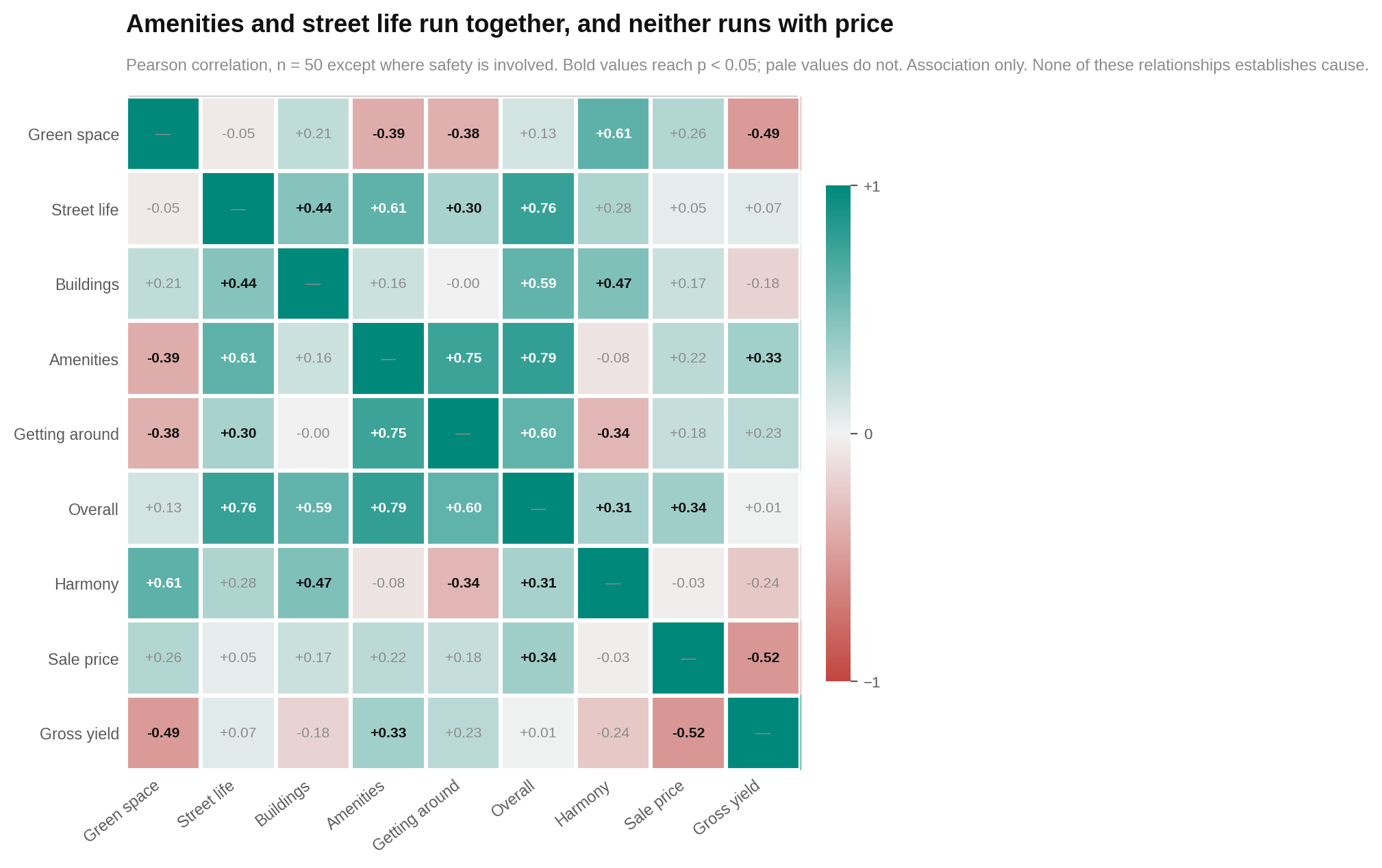
The final two charts are for readers who want to inspect the machinery. The first is a relationship matrix. Every square compares two measures. Stronger positive colours mean the pair tends to rise together; stronger negative colours mean one rises as the other falls. Look for the cluster linking amenities, street life and overall score, plus the negative price-yield relationship.
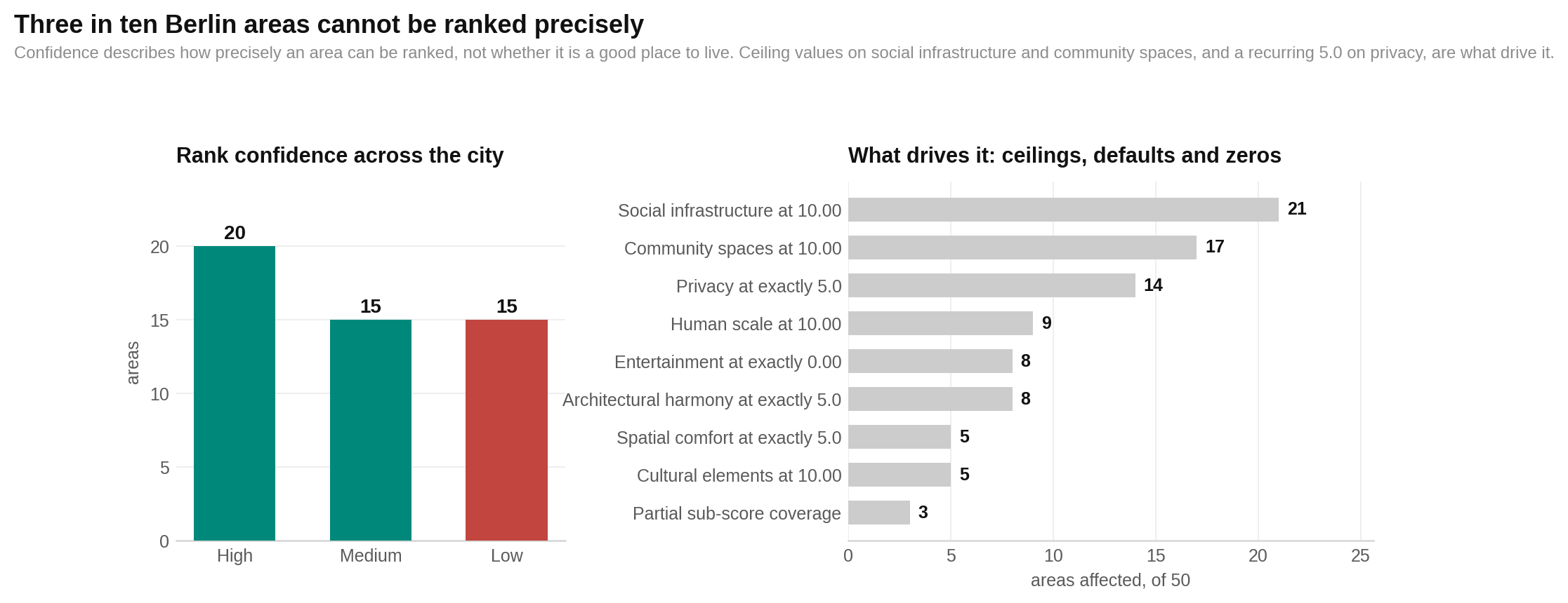
The last chart explains rank confidence. It shows how repeated ceiling, default and zero values reduce the system’s ability to separate nearby areas. Higher confidence means the row can be placed more precisely, not that the area is better. Notice how many measures collect at exactly 10, 5 or 0.
Sample and score ranges
- 50 areas: 39 in Berlin and 11 in Brandenburg.
- Overall scores: 5.87 to 8.42; mean 7.53; median 7.63; standard deviation 0.53.
- Score bands: 9 very strong, 34 strong, 6 above average and 1 around average. None is below average on the report’s absolute bands.
- Sale prices: €3,130 to €7,500 per square metre; median €4,595; mean €4,798; 2.4-to-1 range.
- Rents: €10.50 to €22.00 per square metre per month; median €16.00.
- Implied gross yields: 2.88% to 5.74%; median 4.28%.
- Harmony: 6.48 to 9.03; mean 7.86.
- Rank confidence: 20 High, 15 Medium and 15 Low. Six pairs share a rank.
Main statistical relationships
| Comparison | Result | Plain reading |
|---|---|---|
| Amenities and overall score | r = +0.785, p < 0.001, n = 50 | Areas with stronger amenities tend to score higher overall. |
| Street life and overall score | r = +0.761, p < 0.001, n = 50 | Stronger street life also tends to accompany higher overall scores. |
| Getting around and overall score | r = +0.601, p < 0.001, n = 50 | Transport and street networks matter, though the narrow range limits separation. |
| Buildings and overall score | r = +0.589, p < 0.001, n = 50 | Better building scores tend to accompany higher overall scores. |
| Green space and overall score | r = +0.126, p = 0.384, n = 50 | No evidence of a citywide relationship; this sample cannot rule out a moderate link. |
| Overall score and price | r = +0.338, p = 0.016, n = 50 | A weak positive association. |
| Price and gross yield | r = −0.517, p < 0.001, n = 50 | Higher sale prices tend to come with lower implied yields. |
| Green space and harmony | r = +0.612, p < 0.001, n = 50 | Greener areas tend to have more even pillar profiles. |
| Harmony and overall score | r = +0.312, p = 0.027, n = 50 | The report does not treat this as useful evidence that balance identifies better areas; the relationship is weak and harmony is blind to score level. |
Prices, centrality and the eight zero-entertainment areas
- Distance from the Brandenburg Gate against sale price: r = −0.551, p < 0.001, n = 50.
- Distance against overall score: r = −0.468, p < 0.001, n = 50.
- Safety against price before the distance control: r = +0.244, p = 0.099, n = 47. This is uncertain, not evidence of no relationship.
- Safety against price after holding straight-line distance constant: partial r = +0.621, p < 0.001, n = 47.
- Green space after the same control: partial r = +0.298, p = 0.038, n = 50. The whole green-space pillar gives +0.359, p = 0.011, n = 50.
- Street vibrancy falls from r = +0.327, p = 0.020 to a controlled −0.065, p = 0.659, n = 50. Cultural elements fall from +0.307, p = 0.030 to +0.028, p = 0.848, n = 50.
- Amenities against price across all 50: r = +0.222, p = 0.122. This provides no clear citywide evidence and cannot rule out a moderate relationship.
- Amenities against price among the other 42 areas: r = +0.520, p < 0.001. Food services move from r = +0.159, p = 0.269, n = 50 to r = +0.566, p < 0.001, n = 42.
- Venue counts against amenities: r = +0.690, p < 0.001, n = 50; rank-based rho = 0.954. Against food services, rho = 0.969.
- The eight-area split was selected after seeing the recorded zeros. It is useful but may inflate the 42-area relationships. Both samples are reported for that reason.
State-border tests
Welch’s two-sided tests compare 39 Berlin areas with 11 in Brandenburg. Amenities differ at p = 0.011, getting around at p = 0.001, sale price at p = 0.003, rent at p < 0.001 and venue counts at p = 0.002. The report found no clear evidence of a border difference for green space (p = 0.274), street life (p = 0.703), buildings (p = 0.264), overall score (p = 0.077), harmony (p = 0.071) or gross yield (p = 0.758). Those null results do not prove equality, especially with only 11 Brandenburg areas.
Robustness and open flags
- Headline relationships were checked with rank-based correlations and after removing the two largest outliers. They were also rerun without Tegel; no coefficient changed sign or significance label.
- The value ranking was recalculated with a different normalisation method. Agreement was high at Spearman rho = 0.936.
- There are three missing cells, all safety scores: Hennigsdorf, Königs Wusterhausen and Schönefeld. No values were invented. Their surviving amenities components were reweighted.
- Street vibrancy strongly overlaps with food services (r = 0.922), cultural elements (0.911), entertainment (0.902) and social infrastructure (0.829), all with n = 50. Busy high streets are therefore partly counted in two pillars.
- Climate comfort ranges only from 7.78 to 7.98, with a standard deviation of 0.043. It separates areas poorly despite carrying the largest street-life weight.
- Building quality has only five distinct values and maintenance six. Building rankings are coarse.
- Reinickendorf and Tegel use identical coordinates and points-of-interest counts and match on 15 of 19 sub-scores. They are not independent observations.
- Straight-line distance to the Brandenburg Gate is a crude centrality measure in a city with several centres. Travel time or the S-Bahn ring would be more informative.
- Price dates run from January 2025 to July 2026. Date and price have r = −0.006, p = 0.966, n = 50, but no price index was supplied for adjustment.
- The source report says sale-price and rent figures were supplied with the export, but it does not name the external property-data provider. That source cannot be independently assessed from the report alone.
- Scores omit schools, healthcare, lake access, commute times and social ties. Correlations are associations, not evidence that one measure causes another.
Methodology · All HoodEx Research · Explore Berlin neighborhoods