Athens neighbourhoods: what your money really buys
Across 63 areas, transport and street life often come without a premium, while greenery and well-kept buildings cost more.
Step out in central Athens and the city arrives all at once. Café tables press against the pavement. Buses and scooters pass within arm’s reach. A shaded square can feel precious after several blocks of stone.
Move towards the quieter northern or coastal districts and the picture changes. Streets open up. Buildings look more polished. Greenery becomes easier to find. The price often rises with it.
HoodEx measured 63 Athens areas, including two neighbourhoods within the municipality of Piraeus. The clearest lesson is not that one corner of the city wins. It is that different parts of Athens offer very different packages.
The short version
- The overall ranking hides much of what matters. All 63 scores fit inside a relatively narrow 3.89-point range. Look at each area’s five-part profile, not just its rank.
- A good street and useful transport do not always cost extra. Street life and getting around are closely tied to a strong HoodEx score, but transport showed no clear price premium in this sample.
- Greenery and well-kept buildings are what buyers pay for. These are Athens’ clearest price signals, even though they contribute less to differences in the overall scores.
- Balance is a separate choice. Melissia is the most even performer, while Plaka leads overall. An area can be excellent at a few things without being an all-rounder.
- Budget hunters have real options. Eleven areas score at or above the city median while costing below the median.
- The data cannot tell you anything about safety. Crime, road safety, policing and perceived security are all missing.
How HoodEx scores a neighbourhood
The system begins with Ekistics, a way of thinking about settlements developed by Greek planner Constantinos Doxiadis. His basic idea was simple. A good place must serve nature, people, social life, buildings and movement at the same time.
HoodEx turns those ideas into five plain-language pillars: green space and environment; street life and human scale; buildings and upkeep; amenities and community; and getting around.
Each pillar receives a score from 0 to 10. Higher is always better. The overall score is the average of the pillars with enough data. In Athens, every area has complete data for all five pillars, so each counts equally.
The scores use a fixed scale rather than grading Athens neighbourhoods against one another. A 7 means the same thing wherever it appears. That helps explain why so much of the city sits in one broad band.
There are two extra scores. Harmony shows how even the five pillars are. Value for money combines measured quality with a lower sale price. Neither replaces the five-pillar profile. Harmony can reward five merely moderate scores, while value depends on a particular quality-versus-price weighting.
The ranking is tighter than it looks
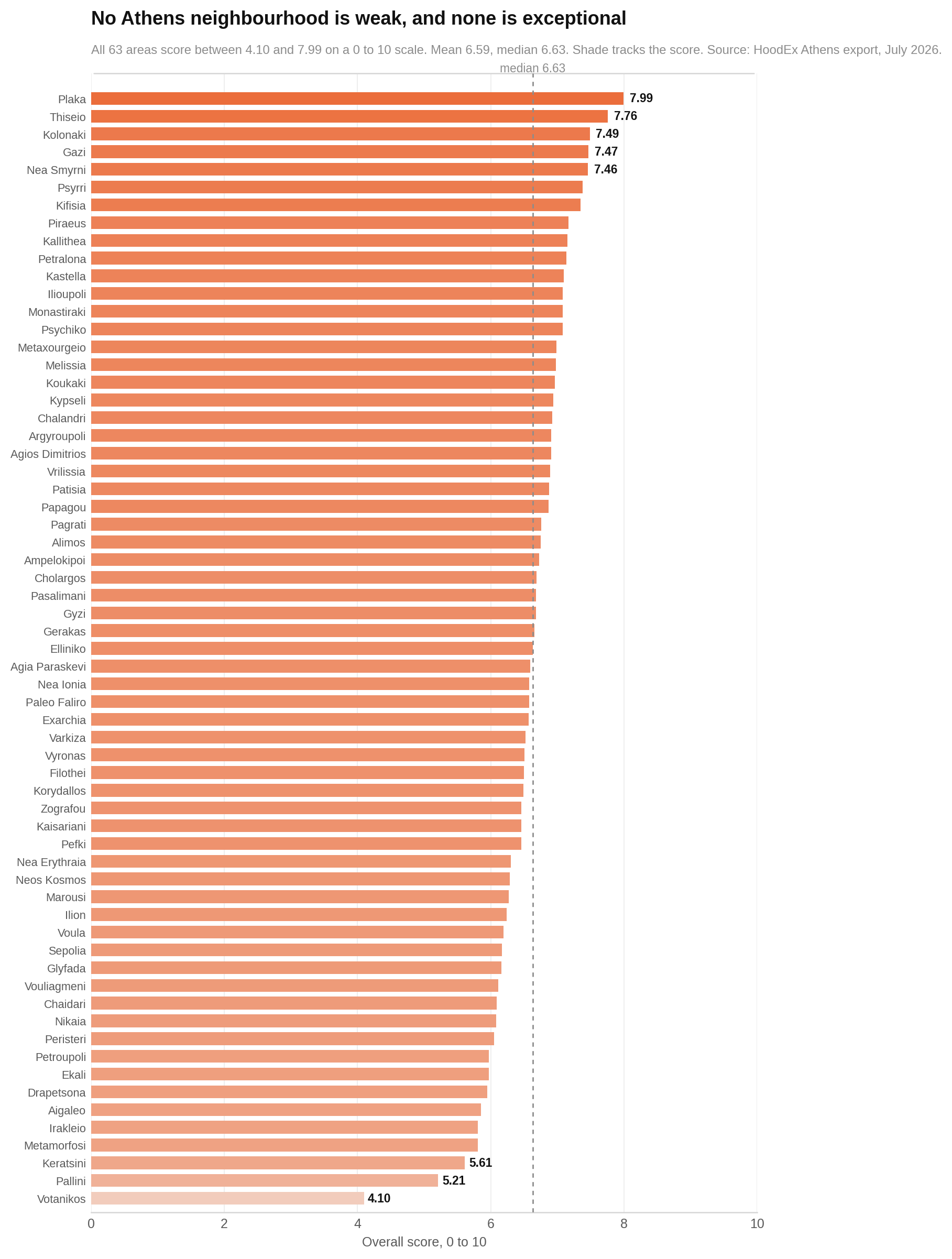
Athens offers few clear-cut winners or losers on the overall measure. Plaka leads at 7.99, followed by Thiseio at 7.76 and Kolonaki at 7.49. Votanikos sits last at 4.10. Forty of the 63 areas fall between 6.0 and 7.5.
The chart below lines up every neighbourhood by overall score. Each bar is one area. A longer bar means a higher score. Look at how tightly most bars bunch together, rather than treating every small change in position as meaningful.
The five pillars tell five different stories
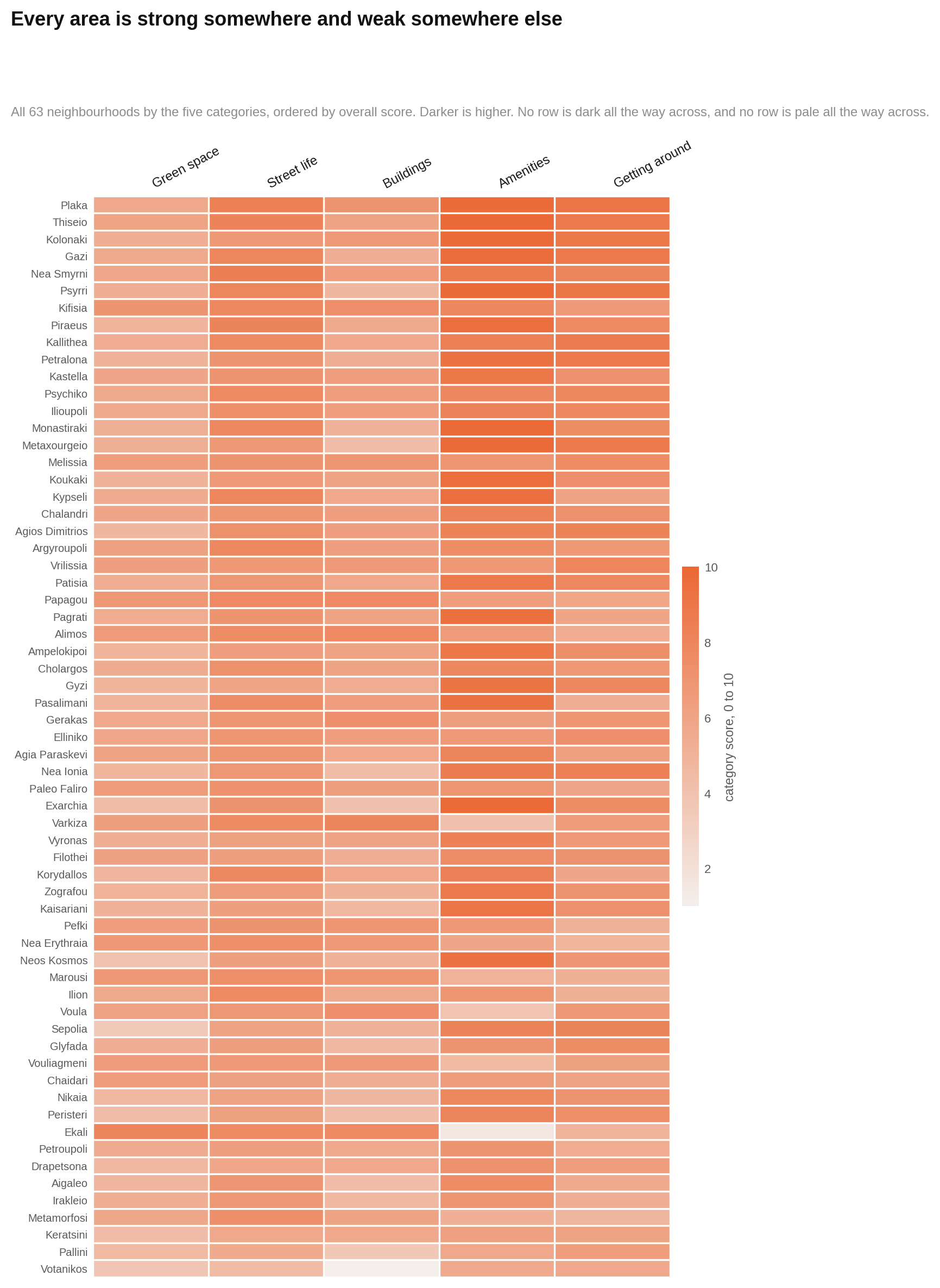
If you want to understand an area, look across its row rather than only at the first number. This chart shows every neighbourhood on all five pillars, ordered by overall score. Each row is an area and each column is a pillar. Darker cells mean higher scores.
Look for uneven rows. Central areas often become dark around amenities and movement but lighter around greenery or buildings. Those contrasts are the real experience hidden inside the average.
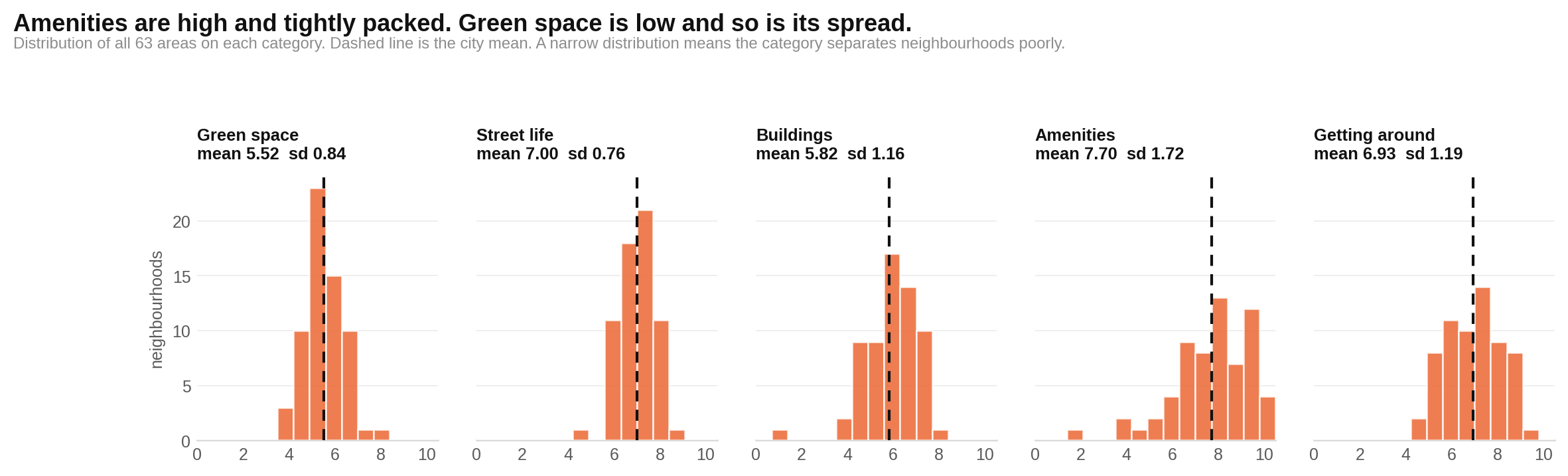
Some pillars separate Athens much better than others. The next chart shows how all 63 scores are spread within each category. Read the horizontal scale from lower to higher scores. A narrow cluster means most neighbourhoods look alike on that measure; a wide one means your choice of area matters more.
Amenities and community stretches from 1.57 to 9.89. Buildings and upkeep also varies widely. By contrast, some underlying measures barely change from one area to another and add little useful separation.
The market charges for a different Athens
If you want greenery and polished buildings, expect to pay more. If you care most about transport, amenities and lively streets, the dataset suggests you can find them across a much wider price range.
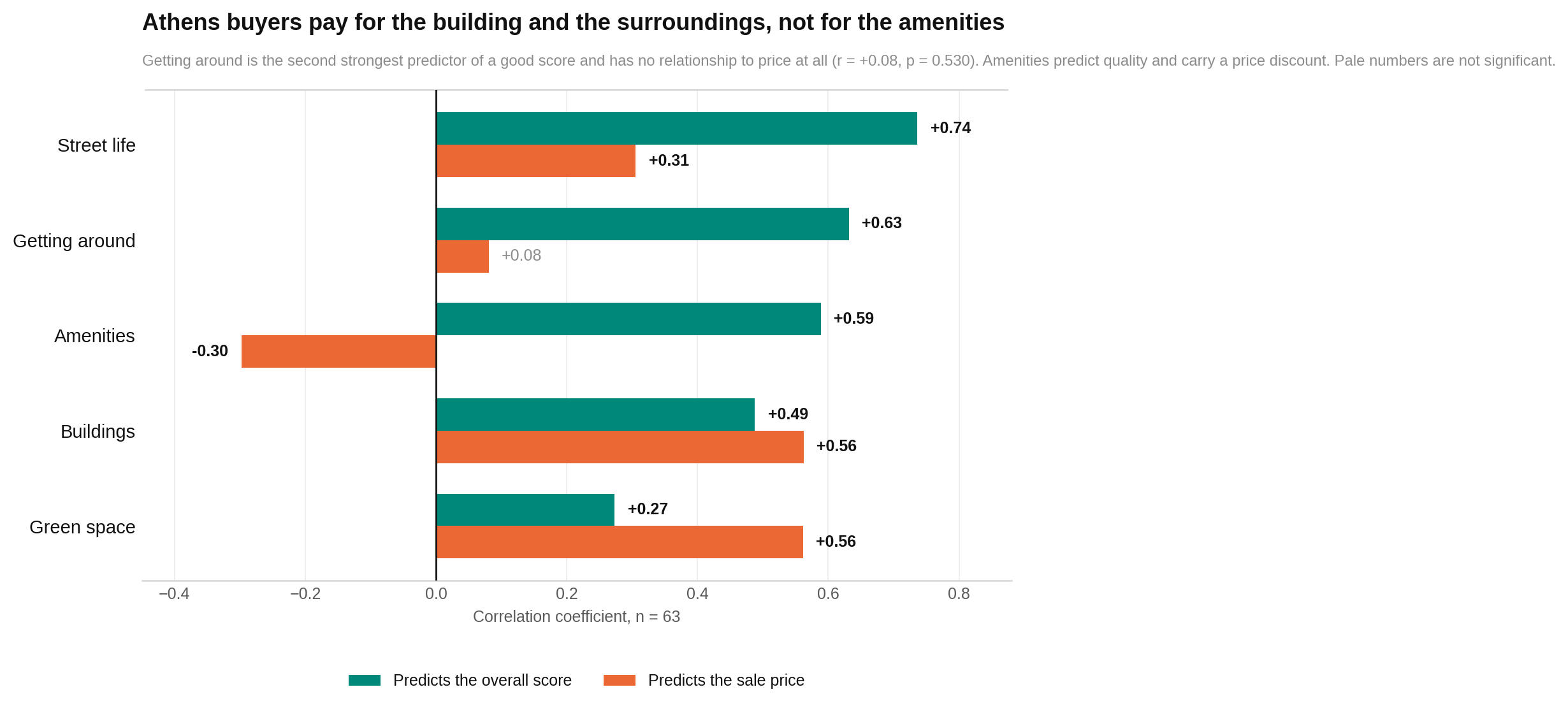
The next chart places each pillar beside two comparisons: how closely it moves with the overall score and how closely it moves with sale price. Each row is one pillar. Stronger marks mean a clearer relationship; direction shows whether the measures rise together or move in opposite ways.
Look for the near reversal. Street life, transport and amenities do much of the work in separating stronger overall scores. Buildings and greenery are the clearest price signals.
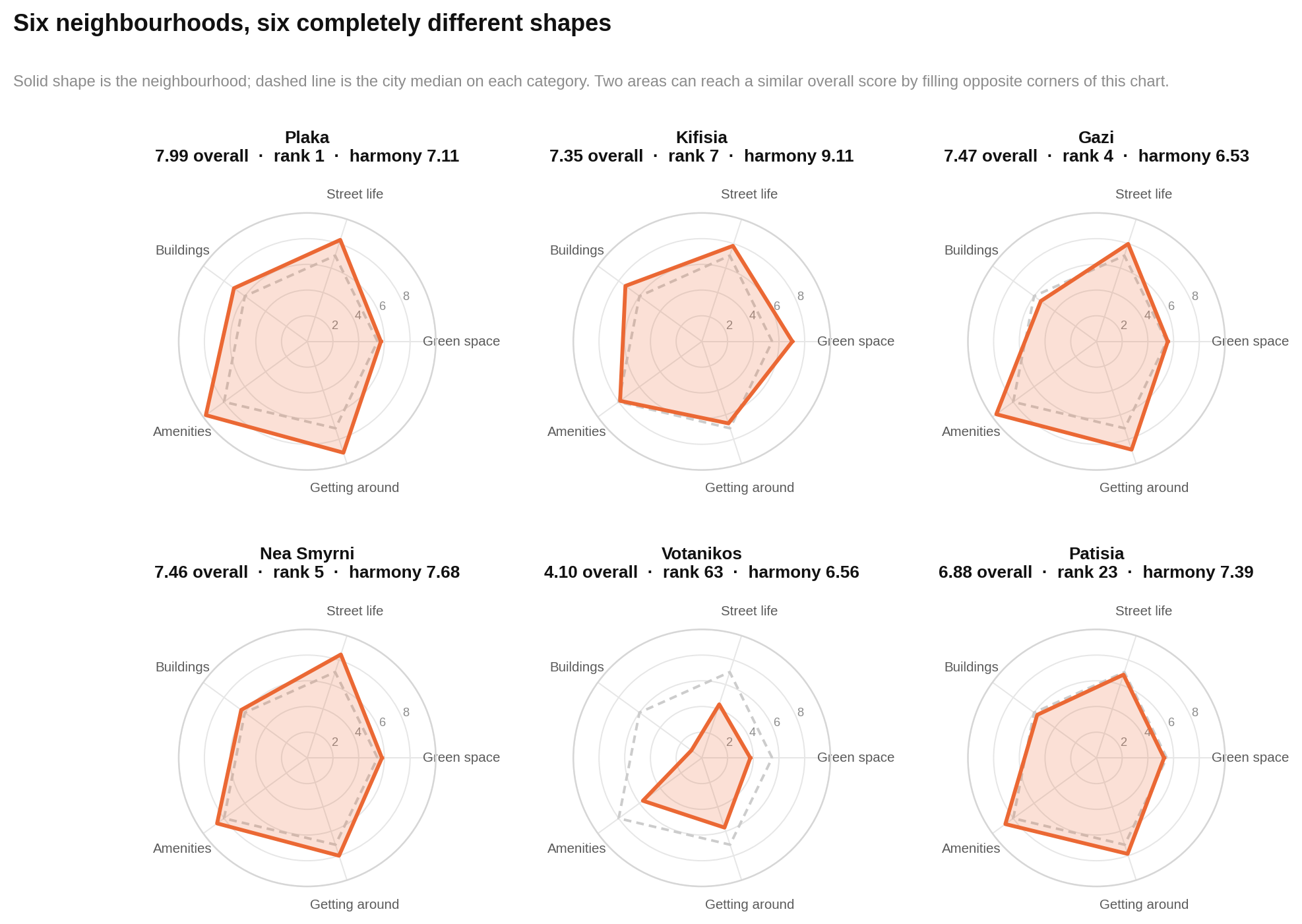
That mismatch becomes clearer when individual neighbourhoods are drawn as shapes. The next chart compares six areas with the city median on all five pillars. The solid shape is the neighbourhood. The dashed shape is the Athens median. Farther from the centre means a higher score.
Look for where each solid shape bulges or caves in. Two areas can reach a similar broad overall band through completely different combinations of greenery, buildings, activity and movement.
Balanced does not automatically mean better
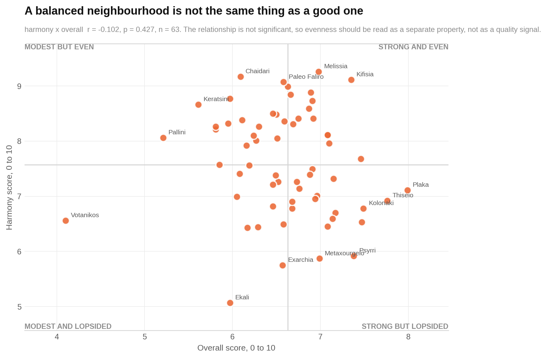
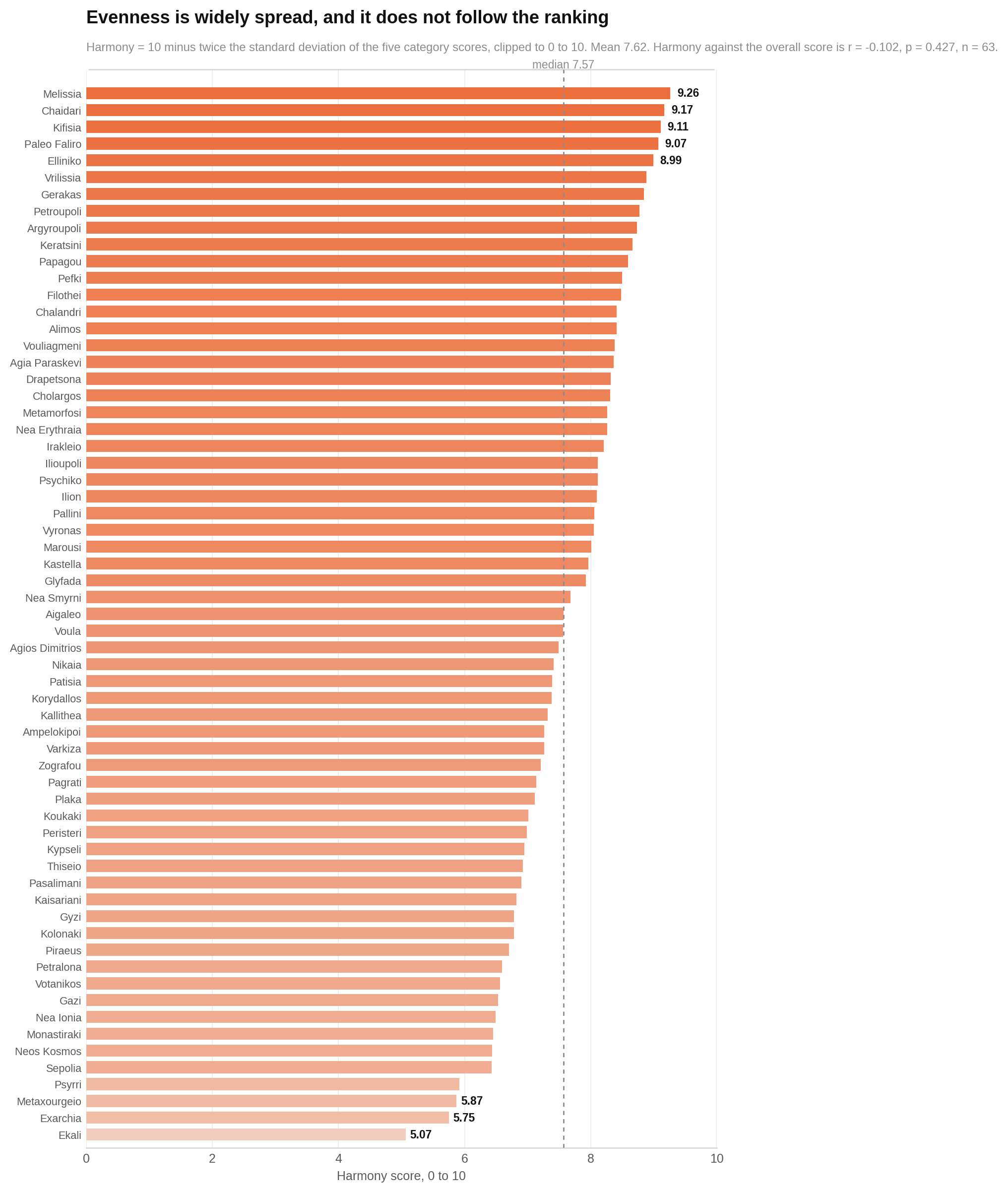
If you dislike serious weak spots, start with the harmony ranking rather than the quality ranking. Melissia leads on balance at 9.26. Its five category scores span only 1.16 points. Chaidari, Kifisia, Paleo Faliro and Elliniko also place near the top for evenness.
Plaka tells the opposite story. It leads overall but its categories span 4.02 points. Psyrri combines exceptional amenities with much weaker buildings. Ekali combines the city’s strongest green-space-and-environment category with its weakest amenities score.
The chart plots overall quality against harmony. Each dot is one neighbourhood. Farther right means a higher overall score; higher up means a more even five-part profile. Look for the lack of a clear slope. We found no evidence that a more balanced Athens area also scores better overall, although this sample cannot rule out a moderate relationship.
The full harmony ranking shows how different this list is from the overall leaderboard. Each bar represents one area, and a longer bar means its five pillars sit more evenly together.
Only two of the ten most balanced areas also appear in the overall quality top ten. Notice Melissia, Chaidari and Kifisia near the top, while several high-scoring central districts sit much lower.
Property prices stretch much farther than quality scores
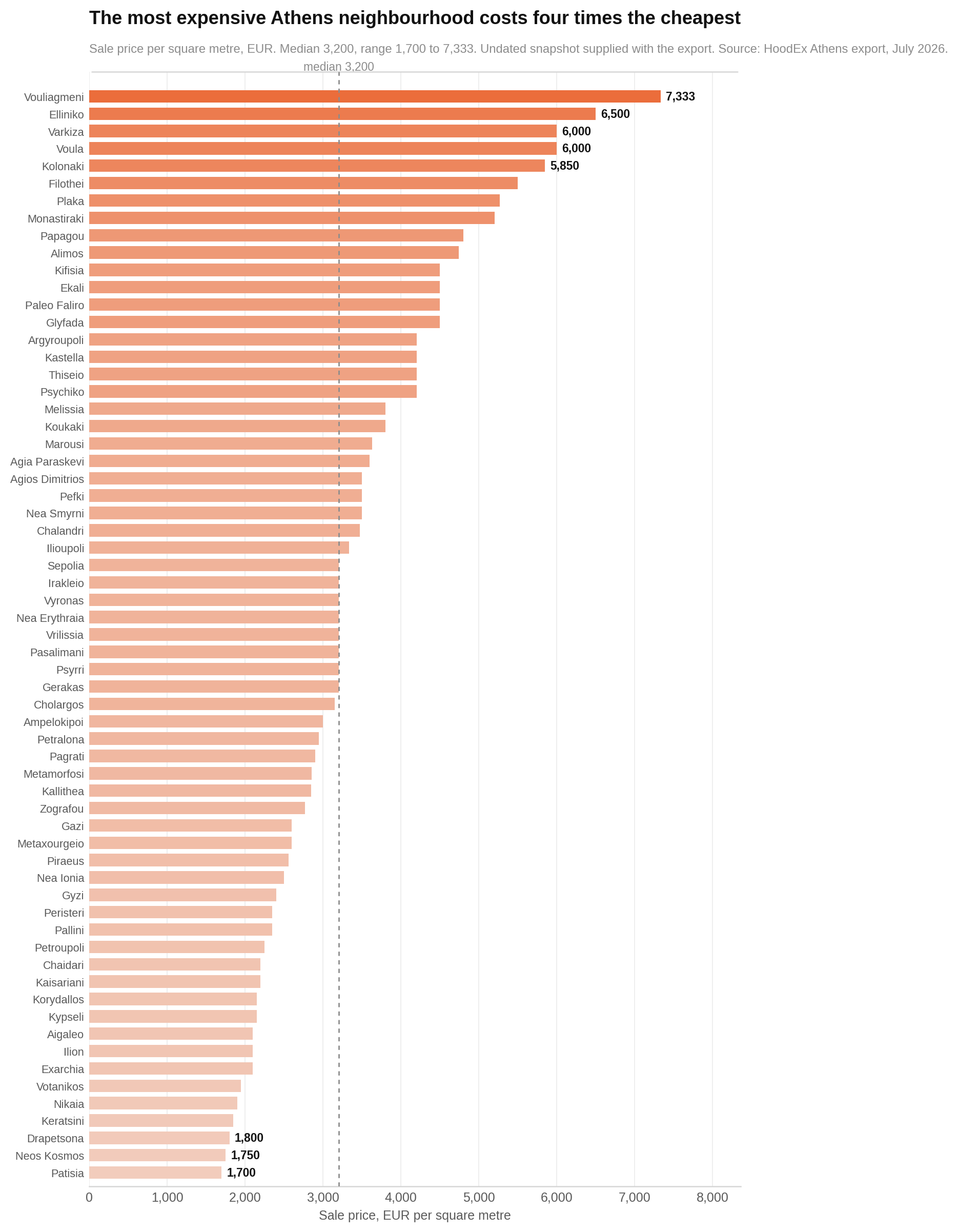
Your budget changes the map more dramatically than the overall ranking does. Sale prices run from €1,700 per square metre in Patisia to €7,333 in Vouliagmeni. That is a 4.3-fold gap. The city median is €3,200.
The chart orders all 63 areas by sale price. Each bar is a neighbourhood, and a longer bar means a higher price per square metre. Look at the small group stretching far beyond the rest. That upper tail pulls the mean above the median.
These price and rent figures arrived with the source export. The export provides no date, provider, method or transaction count, so they should be treated as indicative rather than as a current market quote.
The best value is not confined to the bottom of the market
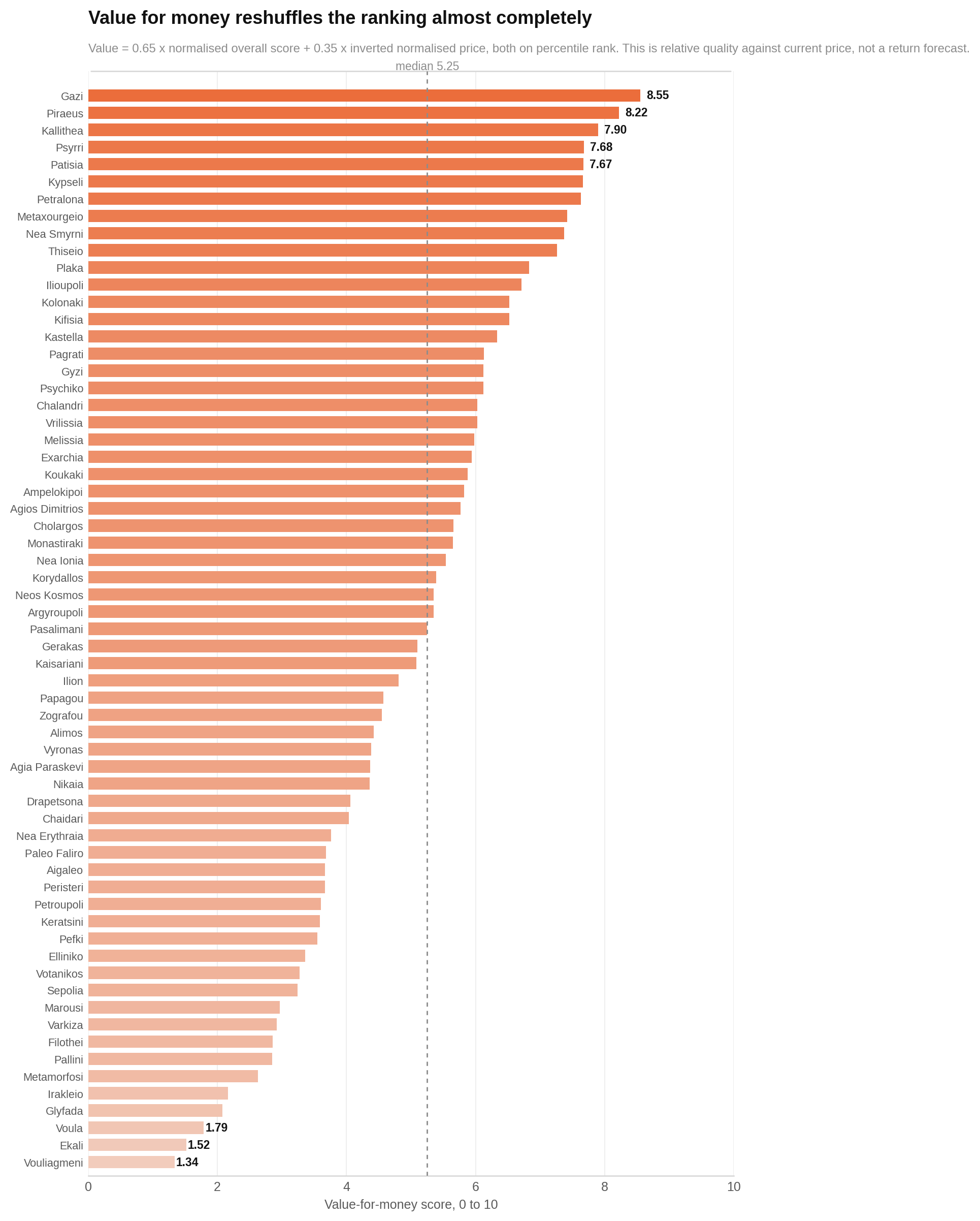
Gazi leads the value-for-money ranking. It combines a 7.47 overall score with a sale price of €2,600 per square metre. Piraeus and Kallithea follow.
The value score gives measured quality 65% of the weight and lower price 35%. That means a cheap area does not win simply for being cheap. It still needs a solid quality score.
The next chart ranks all 63 areas on that combined measure. Each bar is one neighbourhood. Longer means more measured quality for the stated sale price. Look for central and inner-city areas near the top, despite their weaknesses in greenery or building condition.
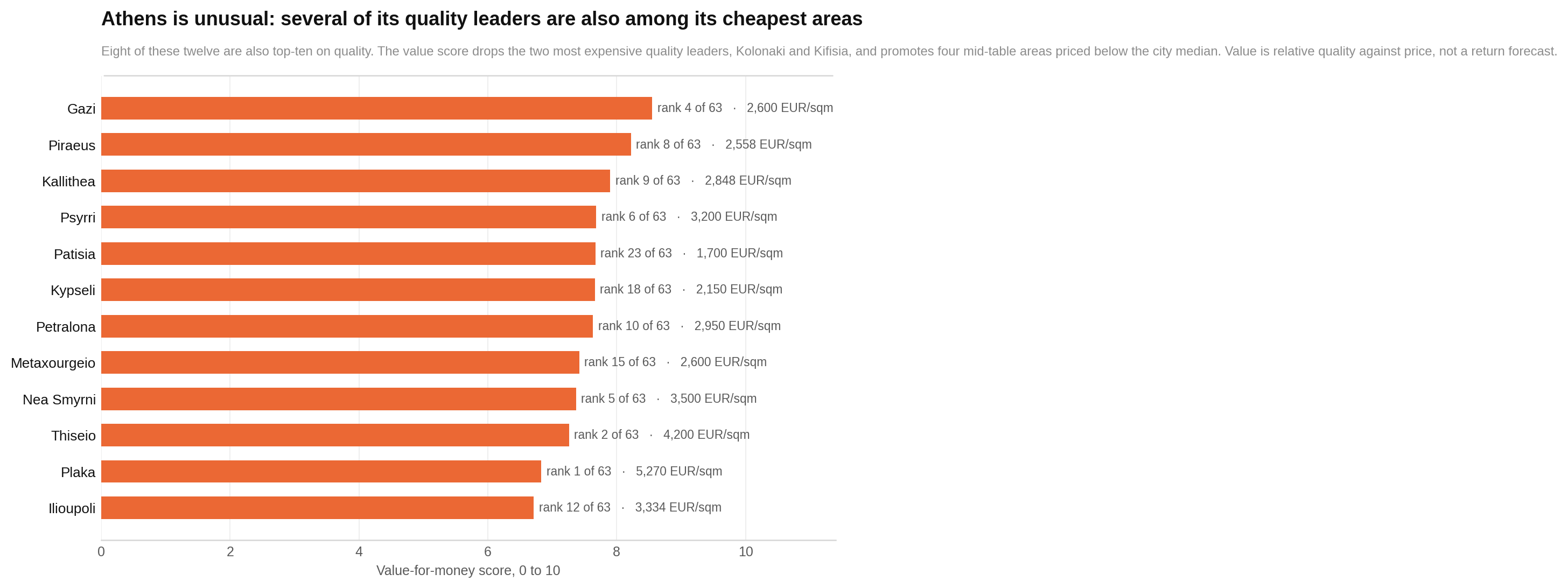
The top twelve make the trade-off easier to inspect. This chart places each best-value area beside its quality position and sale price. Read the value ranking first, then compare the quality rank and price shown alongside it.
Eight of the top twelve value areas are also in the quality top ten. The value calculation mainly removes expensive leaders such as Kolonaki and Kifisia, then promotes cheaper areas including Patisia, Kypseli, Metaxourgeio and Ilioupoli.
Eleven areas sit on the useful side of both medians
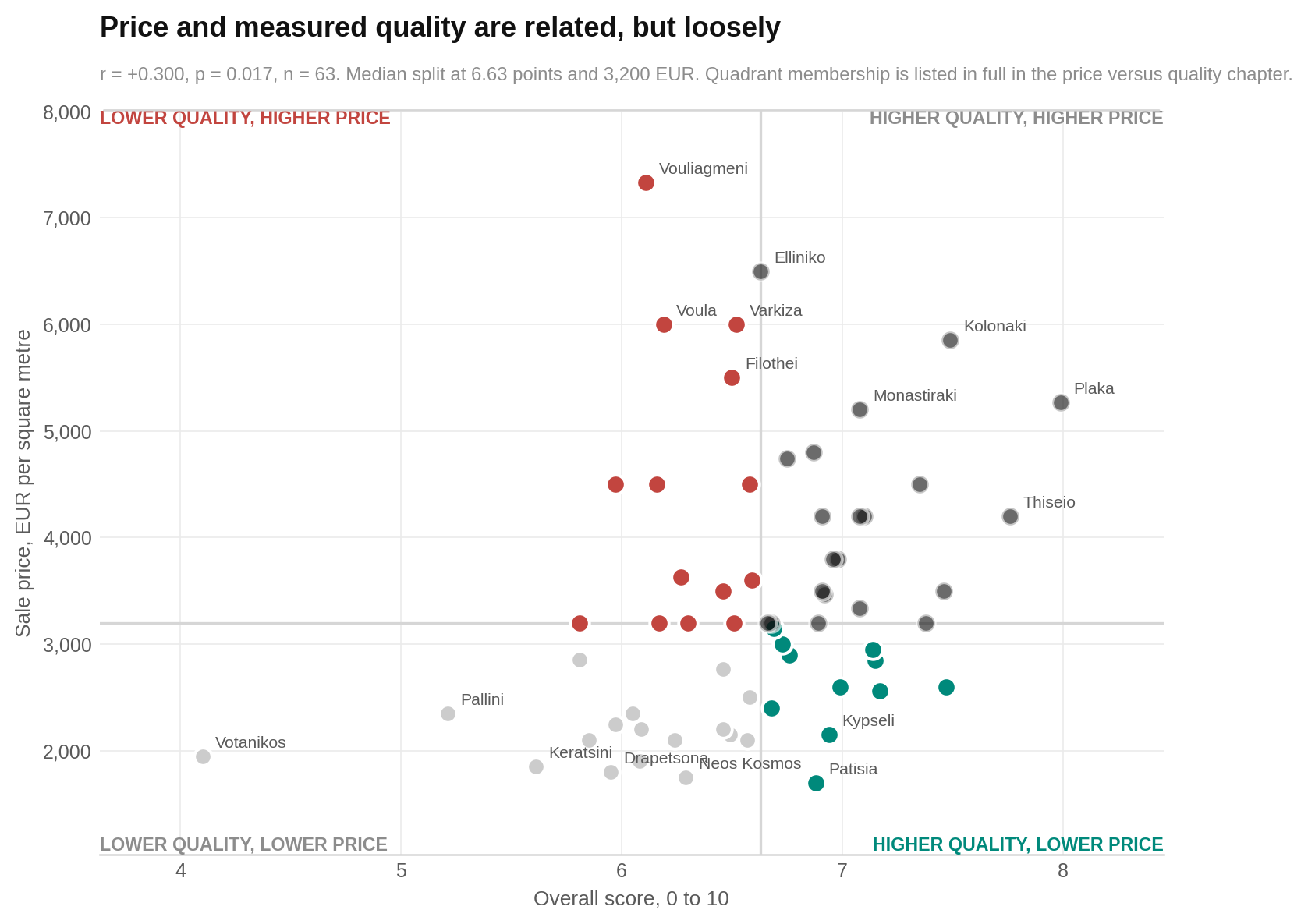
For a budget-conscious search, start with Ampelokipoi, Cholargos, Gazi, Gyzi, Kallithea, Kypseli, Metaxourgeio, Pagrati, Patisia, Petralona and Piraeus. Each scores at or above the city median while costing below it.
The chart places overall score on one axis and sale price on the other. Each dot is a neighbourhood. Higher means a stronger score; farther toward the expensive side means a higher price. The lines mark the two city medians, creating four groups.
Look at the higher-quality, lower-price section. It contains those 11 possible value opportunities. The opposite section contains 14 areas whose premium is not fully explained by the indicators available here.
Some pillars overlap more than they appear to
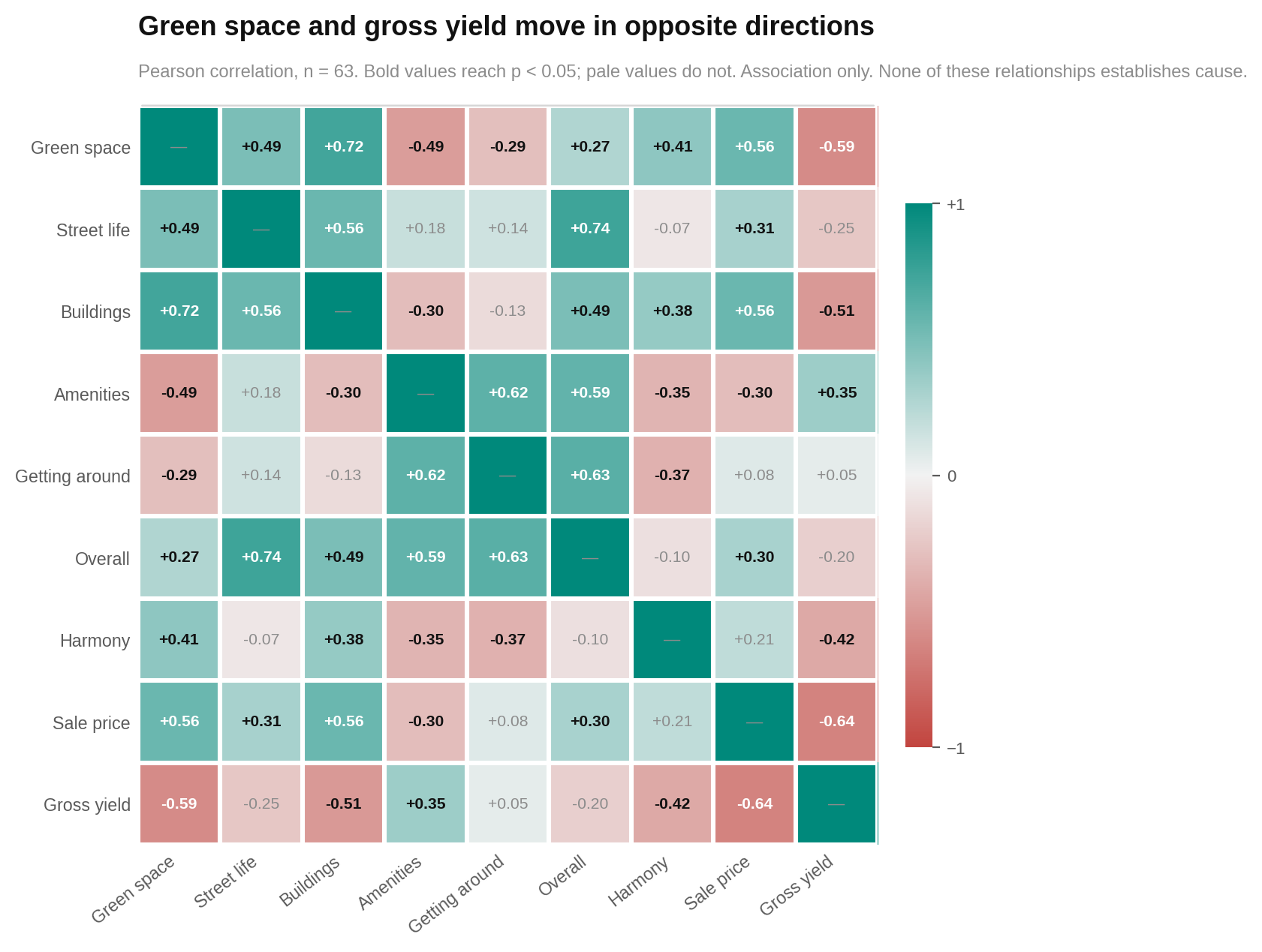
The five pillars are presented separately, but parts of them often move together. Lively streets closely track food, culture and entertainment. Environmental quality closely tracks building maintenance and building quality.
The chart below compares every major measure with every other one. Each square represents a pair. The colour direction shows whether they rise together or move in opposite directions, while deeper colour means a stronger relationship.
Look for the clusters around street life, amenities and movement, and another around greenery, buildings and price. This overlap matters because a lively, well-kept street can influence more than one pillar and therefore be counted more than once in the overall score.
Who each area suits best
No neighbourhood is best for everyone. These shortlists use only the priorities and scores contained in the report. They are places to investigate, not automatic recommendations.
| If you are… | Look at… | Why |
|---|---|---|
| Moving with a family | Nea Smyrni, Plaka, Gazi, Melissia, Psychiko, Thiseio | These lead the report’s family fit, which combines greenery, environmental quality, room, social infrastructure, community spaces, maintenance and transport. Most are not cheap, and green space remains the group’s common weakness. |
| A young professional | Psyrri, Plaka, Thiseio, Gazi, Metaxourgeio, Kolonaki | They score strongly for street activity, food, culture, entertainment, walking and transit. Buildings and upkeep are the common trade-off. |
| A student or first mover | Metaxourgeio, Patisia, Psyrri, Gazi, Exarchia, Gyzi | The student matcher puts affordability first, then transport, food, entertainment and culture. Most cost no more than the city median, but building condition is often weaker. |
| A renter watching monthly costs | Patisia, Metaxourgeio, Ilioupoli, Kaisariani, Piraeus, Kallithea | These lead when lower rent is combined with transit, food, social infrastructure and maintenance. Greenery is the shared compromise. |
| A foodie or nightlife lover | Psyrri, Thiseio, Exarchia, Metaxourgeio, Monastiraki, Kolonaki | They lead on entertainment, food and street activity. Several are expensive, and the group is generally weaker on buildings and upkeep. |
| Seeking quiet residential living | Ekali, Marousi, Papagou, Varkiza, Pefki, Voula | These rank highest for privacy, calm, greenery and environmental quality. Amenities are the common weakness, and five of the six are at or above the median price. |
| Living without a car | Psyrri, Plaka, Kolonaki, Metaxourgeio, Thiseio, Gazi | They combine usable street networks, transit and daily services. Buildings and upkeep are often the price of that convenience. |
| A value-focused buyer | Gazi, Piraeus, Kallithea, Psyrri, Patisia, Kypseli | These are the top six on the published value score. Most sit below the median sale price, but greenery is usually the weakest pillar. |
| Focused on gross rental yield | Neos Kosmos, Exarchia, Patisia, Nikaia, Peristeri, Keratsini | They have the highest implied gross yields in the supplied figures. These are simple rent-to-price ratios, not forecasts, and they exclude vacancy, tax, costs and condition. |
| Looking for the most balanced profile | Melissia, Chaidari, Kifisia, Paleo Faliro, Elliniko, Vrilissia | Their five category scores are the most even. Balance does not guarantee a higher overall score, and most of this shortlist is not inexpensive. |
| Choosing mainly on safety | No supported shortlist | The Athens dataset contains no crime, policing, road-safety or perceived-security measure. A high HoodEx score must not be read as evidence of safety. |
The bottom line
Do not pay too much attention to whether an Athens neighbourhood ranks 12th or 16th. Most areas sit in the same broad overall band, and uncertain inputs can move close rankings around. Start with the shape of the five pillars instead.
If you want lively streets, useful transport and abundant amenities, Athens offers several lower-priced choices. Gazi, Piraeus, Kallithea, Kypseli, Metaxourgeio, Patisia and Petralona are among the places worth examining, depending on which weakness you can accept.
If you want greenery, calm and polished buildings, prepare for a higher price and often fewer amenities. That is the main practical trade-off in this dataset.
Finally, treat the scores as a way to build a viewing list. They do not cover schools, safety, healthcare, employment, sea access, personal commute routes or family ties. Visit the areas. Walk them at the times you would actually be outside. The numbers can tell you where to look, but not whether a street feels like home.
The fine print
Coverage and score ranges
The report covers 63 areas and 18 sub-scores, grouped into five categories. It was scored on 24 July 2026 and generated on 29 July 2026. All 63 areas have complete score and price fields; nothing was imputed or dropped. Overall scores have mean 6.59, median 6.63, sample standard deviation 0.62 and range 4.10–7.99. The score bands contain 14 strong, 40 above-average, eight around-average and one below-average area; none is weak, very weak, very strong or exceptional.
Category numbers
Category means are: amenities and community 7.70; street life and human scale 7.00; getting around 6.93; buildings and upkeep 5.82; green space and environment 5.52. Green space itself averages 4.73 and ranges from 2.45 to 8.31. Category ranges are 3.52–8.06 for green space and environment, 4.38–8.46 for street life, 1.00–8.00 for buildings, 1.57–9.89 for amenities and 4.80–9.10 for getting around.
Headline relationships
All headline tests use n=63. Overall score is associated with street life and human scale at r=+0.736, p<0.001; getting around at r=+0.631, p<0.001; amenities and community at r=+0.588, p<0.001; buildings and upkeep at r=+0.488, p<0.001; and green space and environment at r=+0.273, p=0.030. The last relationship does not survive every robustness check and is treated as a direction rather than a firm conclusion.
Sale price is associated with building and upkeep at r=+0.562, p<0.001; green space and environment at r=+0.561, p<0.001; street life at r=+0.306, p=0.015; and amenities and community at r=-0.298, p=0.018. Getting around against price gives r=+0.081, p=0.530. This is not proof of no relationship: the sample found no evidence that transport predicts price, but it cannot rule out a moderate link.
Overall score against sale price gives r=+0.300, p=0.017. Rent against quality gives r=+0.312, p=0.013. Rent and sale price give r=+0.890, p<0.001. Gross yield is associated with sale price at r=-0.640, p<0.001 and with green space and environment at r=-0.588, p<0.001.
Harmony against overall score gives r=-0.102, p=0.427, with Spearman rho=-0.171. This null result does not prove that balance and quality are unrelated in the population; it means this sample found no evidence that one predicts the other.
Sub-score and overlap checks
The strongest price relationships among sub-scores are building quality r=+0.594, maintenance +0.549, climate comfort +0.484, environmental quality +0.458, privacy +0.440, architectural harmony +0.404, social infrastructure -0.396, green space +0.390, spatial comfort +0.381 and food services -0.338. Their p values are below 0.001 for the first five, 0.001 for architectural harmony and social infrastructure, 0.002 for green space and spatial comfort, and 0.007 for food services.
Cross-category overlap is high for street vibrancy and food services (r=+0.885), street vibrancy and cultural elements (+0.870), environmental quality and maintenance (+0.866), environmental quality and building quality (+0.825), street vibrancy and entertainment (+0.810), and street vibrancy and social infrastructure (+0.807); all p<0.001. No correction was applied. This leaves an open flag that related qualities may be counted in more than one pillar.
Robustness
Headline findings were checked with Spearman rank correlation and after removing the two largest outliers. Street life, getting around and amenities against overall score survived those checks. Price relationships were calculated on percentile ranks so Vouliagmeni’s high price could not dominate them. Recomputing value with min-max scaling produced Spearman rho=0.935 against the published ranking.
Piraeus overlaps geographically with Kastella and Pasalimani, so the rows are not independent. Removing the Piraeus municipality row changes price against overall from 0.300 to 0.313, harmony against overall from -0.102 to -0.089, and amenities against overall from 0.588 to 0.582. No report conclusion changes.
Prices and yields
Sale price has median €3,200 per square metre, mean €3,425 and range €1,700–€7,333. Rent has median €12 per square metre per month and range €8–€22. Gross yield has median 4.80% and range 3.25%–8.23%. The source export gives no date, provider, methodology or transaction count for prices or rents. Rent has only 20 distinct values; 16 areas are exactly €12 and five are exactly €22. Yield is annual stated rent divided by stated price and excludes costs, vacancy, tax and condition.
Data quality and missing topics
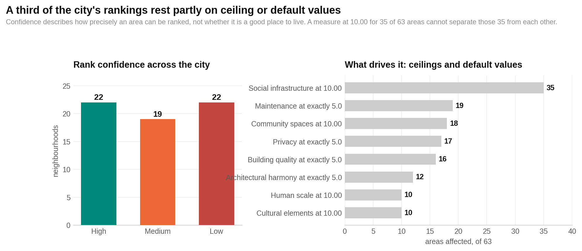
Twenty-two of 63 areas have low rank confidence. Social infrastructure is exactly 10.00 in 35 areas; community spaces in 18; human scale in 10; cultural elements in 10. Maintenance is exactly 5.0 in 19 areas, privacy in 17, building quality in 16, architectural harmony in 12 and spatial comfort in nine. Entertainment is recorded as zero in four areas and food services in one. These may be ceilings, defaults or genuine measurements and were not altered.
Votanikos sits 1.51 points below the next-lowest overall score and records the city minimum on six of 18 sub-scores. That concentration may reflect a collection problem, so its result is flagged rather than treated as settled.
The dataset has no measures of crime, policing, road safety, perceived security, education, healthcare, employment or demographics. It also omits specific commute times, schools and sea access. No conclusion about those topics should be inferred from any score.
The final chart shows where rank confidence weakens. Read each area’s confidence label alongside the counts of ceiling and recurring default values. More flagged inputs mean less confidence in its precise position. Look for how often perfect 10s and exact 5s appear: they are why nearby ranks should be treated as broad bands rather than exact order.
Methodology · All HoodEx Research · Explore athens neighborhoods